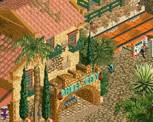
Looks great, although a little bit chaotic. Had you tried the rocks as just brown? I think this is a little overbronzed. Combination of the architecture objects is fantastic. I would probably suggest to reduce the object diversity a little, to make a clearer aesthetic language.
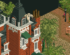
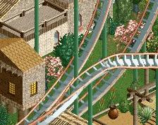
Absolutely gorgeous. Love the different levels in the paths and the windiness of it all. It does lack the breath of life though. Some more clutter, lights and bins would help.
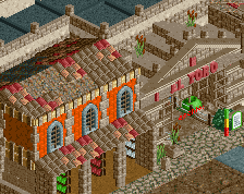
Please consider a different alternative for the ugly palm on the left. Perhaps replacing that will kickstart this project again, whatever it is. Really cool stuff man. Hope we'll get some properly sized solo work from you within the next year...
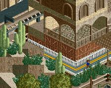
I agree with Terry about the flags, they're pretty iconic in this setting. Colours are always warm, and complex and they work perfectly on this screen.
 27-October 24
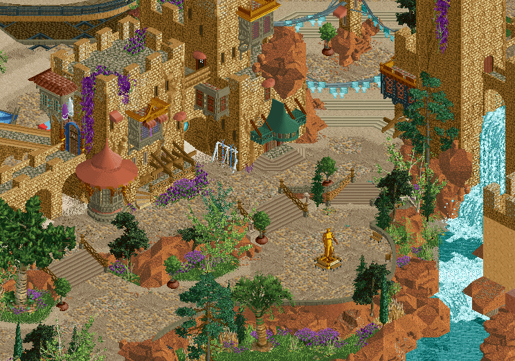

I love the colors! Very nice screen, i hope you will be motivated one day to work on it again!
Yes, finish this!
Looks great, although a little bit chaotic. Had you tried the rocks as just brown? I think this is a little overbronzed. Combination of the architecture objects is fantastic. I would probably suggest to reduce the object diversity a little, to make a clearer aesthetic language.
Beautiful! Especially loving the warm colours, landscaping and the terraced paths
The purples make it IMO. Love the flowers hanging off the buildings.
That looks HOT! Love the archy and the purple is just perfect.
Well let's hope this fiesta gets you back to building! This screen makes us scream for more. So good man. Love the purple flowers everywhere.
Nice combination of various browns with red-orangish clay-like sand. The purple catches your idea on top of it and completes it.
Lovely. Really unique rockwork on/around the buildings.
Absolutely gorgeous. Love the different levels in the paths and the windiness of it all. It does lack the breath of life though. Some more clutter, lights and bins would help.
The flags are in a league all their own, and they're perfect for a fiesta. Whatever the hell this is, finish it!
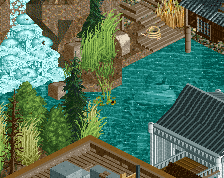
Wow I adore all of the layers; those diagonal steps really sell the area to me.
Please consider a different alternative for the ugly palm on the left. Perhaps replacing that will kickstart this project again, whatever it is. Really cool stuff man. Hope we'll get some properly sized solo work from you within the next year...
I agree with Terry about the flags, they're pretty iconic in this setting. Colours are always warm, and complex and they work perfectly on this screen.
So brown is a theme Love all the elevation changes, crunch and the color scheme. The little bits of color really make it pop.
You better send this to me; it really is missing the Steve touch that usually elevates your work.
this is glorious, what a great color mix. really warm atmosphere, and an interesting mix of things going on. i want to learn more about this theme.
Stunning stuff, love the crunchy texture work.
nice objects and colors, the feeling of reality is amazing