Screenshot / Haunted Harbour
-
 16-October 24
- Views 3,649
- Fans 26
- Comments 35
-
 Description
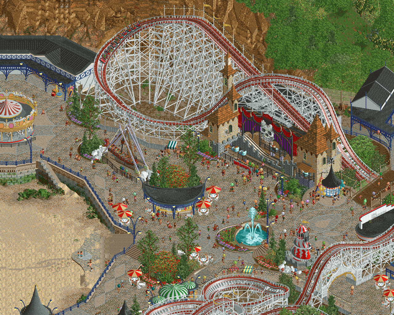
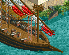
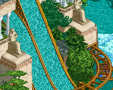
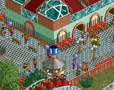
Haunted Harbour, formerly known as Whitby Sands, is an amusement park situated in the North Yorkshire coastal town of Whitby. Haunted Harbour is home to “Woodpecker”, a wooden roller coaster by American coaster designers Frank Prior and Frederick Church that has stood since 1925 and is the only one of it’s kind to still exist outside of the States since the demolition of “The Bobs” at Manchester’s Belle Vue in 1970.
Nearly the same age as Woodpecker, and tucked underneath it’s lift hill (due to limited space available on the promenade at the time) is the ghost train ride “Castle Dracula” which opened in 1930. -
 Full-Size
-
26 fans
 Fans of this screenshot
-
 Tags
Tags
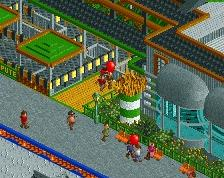
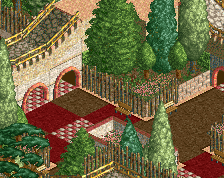
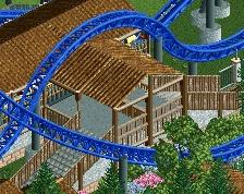
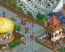
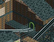
Another epic Alex screen! Love the composition, archy, layering of details. I almost missed the carrousel on the left, but damn that looks perfect. Only miniscule nitpicks I could find where the above mentioned rocks and the ´tear´-shaped pattern on the path in front of the bridge. That doesn't make sense to me from this angle, but maybe it fits when the screen is rotated. I was also wondering if the moon-shaped bar/foodstand is a recreation from a real-world stand? If not, I'd consider making the backside a straight diagonal. I think that would make more sense from a realism perspective. Now please excuse me while I'm going to mob up all the drewl I've spilled over this screen.
I stand with MTC
Love this, Alex. I want to point out some things that I especially love: the rocks with algae, the blue metal frameworks and lamps, the carousel and the coaster supports. I agree with Jene about the rockwork and the tear pattern in the path. Somehow that doesn't work.
Inspiring.
i've no idea how you keep doing it but you're already this great and you seem to still improve
Dude you must be playing this game on a strict schedule of at least 2-4 hours per day, every day of the week or something. Your command of every aspect of this hobby is impressive. Gorgeous screen. I also think the rock face could be improved as others have pointed out but that's it. The entire area oozes atmosphere. Bravo.
Glad you are enjoying the new objects nice screen!
I like the crescent shape motif that creeps in. Haunted Harbor does kind of have a "dark Luna" vibe so if that was the intention or just a happy accident, it works well.
Pfoeh... just amazing. Gorgeous.
thanks for all the comments and feedback guys - really appreciate it
idk how you can crit this, so damn fire
Nice job! I really like this transition.