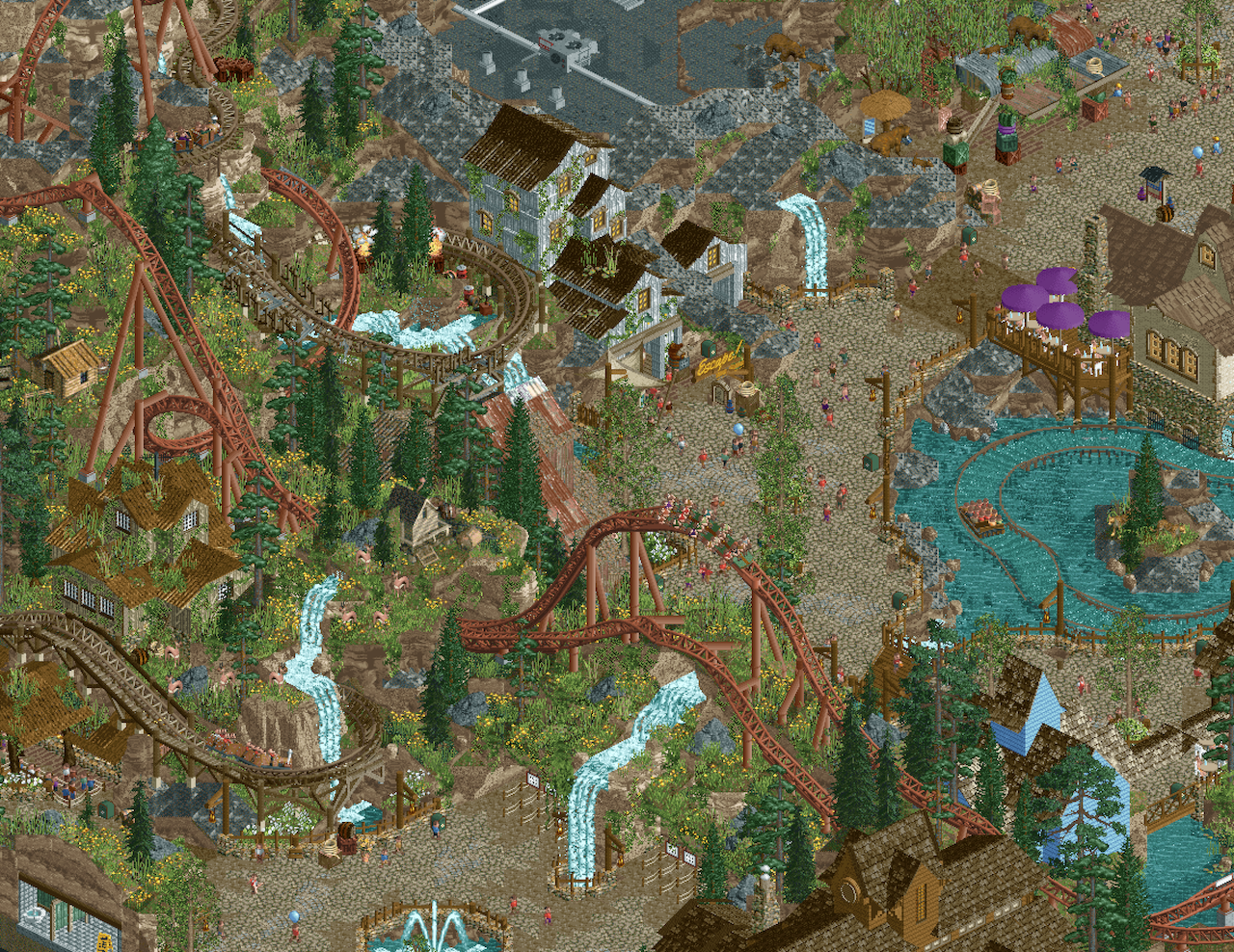
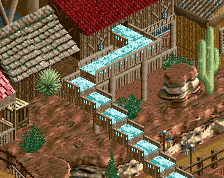
id say the white building needs a bit of definition, maybe a trim around the roof? otherwise astounding as usual. i'd be mindful of all the browns in the landscaping too - it runs a risk of becoming muddied in terms of readability. am i right in thinking all the browns are non-horizontal surfaces? something the default landscaping is great at is definition between the vert surfaces and the small hills. nitpicking, but what else would we do with the best of the best?
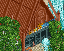
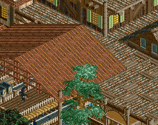
there's so much amazing stuff here, love it. there are a couple of things i'm not sure on, might help: the yellow flowers might be a little more readable as little clumps rather than scattered throughout the whole landscape? also the building on the left is really blending in, i think it's probably the roof color for me. or maybe that in combo with the wall color? either way i'd probs try something a little different
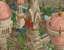
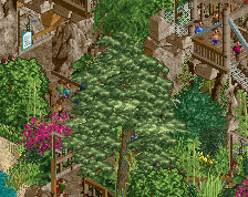
Pretty nice atmosphere, although the old landblocks at the top seem kinda messy to me and the architecture a bit unpolished and simplistic. Love the terraforming and foliage though, nice variation and spread there!
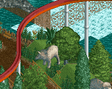
Bold choice to use a landform as an area entrance! Everything here is composed in such a naturally realistic way - with this level of ride interaction and landscape integration, I know I would enjoy walking around this Critter Country significantly more than I do around any extant Disney version. Great mixture here of Fisch, Krypton, and standard forest grass blocks.
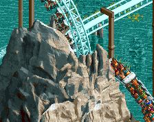
The gray landblocks, when used in a high concentration, do have a tendency to create a repetitive texture that highlights the existence of the grid. I like the usage of painted gray rocks interspersed with them; different types of blocks (1h Fisch blocks, asteroid blocks, Levis land blocks, etc.) that can be painted to match those and the gray landblocks might help bring the rock formation together in a way that breaks more from this grid pattern.
Lovely stuff as always. I think one thing to consider here is contrasting the path a little more with the rockwork. Right now, readability is iffy with the entrance tunnels that flank the small waterfall.
Also I agree with Turtle - perhaps adding variety to the yellow flowers could help too. Don't be afraid to just have different shades of green!
The standard in organic parkmaking. Just incredible.
However, I must agree with the sentiment that the overgrowth on the rocks and the yellow flower melange looks a little messy. It disconnects a bit with your otherwise super purposeful build.
Thank for the feedback, everyone. It's been hard for me to gauge where "organic" slides over into "messy".
amazing amazing work, only thing i'd change is the colour on the rocks as they feel too washed out atm...
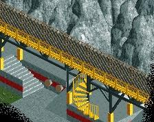
Cheers, BG! I was hoping I could get this out before anyone made a Stryker coaster in H2H, but I'd be lying if I said I haven't been returning again and again to look at the one in Raveland haha
It's been hard for me to gauge where "organic" slides over into "messy".
That's exactly why it's hard. But you're already among the best at it. I think the feedback you've received talks about moving +/-2% in the 85-95% range. And it's hard to move there at all.
 04-September 24
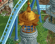
id say the white building needs a bit of definition, maybe a trim around the roof? otherwise astounding as usual. i'd be mindful of all the browns in the landscaping too - it runs a risk of becoming muddied in terms of readability. am i right in thinking all the browns are non-horizontal surfaces? something the default landscaping is great at is definition between the vert surfaces and the small hills. nitpicking, but what else would we do with the best of the best?
there's so much amazing stuff here, love it. there are a couple of things i'm not sure on, might help: the yellow flowers might be a little more readable as little clumps rather than scattered throughout the whole landscape? also the building on the left is really blending in, i think it's probably the roof color for me. or maybe that in combo with the wall color? either way i'd probs try something a little different
Pretty nice atmosphere, although the old landblocks at the top seem kinda messy to me and the architecture a bit unpolished and simplistic. Love the terraforming and foliage though, nice variation and spread there!
Bold choice to use a landform as an area entrance! Everything here is composed in such a naturally realistic way - with this level of ride interaction and landscape integration, I know I would enjoy walking around this Critter Country significantly more than I do around any extant Disney version. Great mixture here of Fisch, Krypton, and standard forest grass blocks.
The gray landblocks, when used in a high concentration, do have a tendency to create a repetitive texture that highlights the existence of the grid. I like the usage of painted gray rocks interspersed with them; different types of blocks (1h Fisch blocks, asteroid blocks, Levis land blocks, etc.) that can be painted to match those and the gray landblocks might help bring the rock formation together in a way that breaks more from this grid pattern.
Lovely stuff as always. I think one thing to consider here is contrasting the path a little more with the rockwork. Right now, readability is iffy with the entrance tunnels that flank the small waterfall.
Also I agree with Turtle - perhaps adding variety to the yellow flowers could help too. Don't be afraid to just have different shades of green!
However, I must agree with the sentiment that the overgrowth on the rocks and the yellow flower melange looks a little messy. It disconnects a bit with your otherwise super purposeful build.
amazing amazing work, only thing i'd change is the colour on the rocks as they feel too washed out atm...
Thank for the feedback, everyone. It's been hard for me to gauge where "organic" slides over into "messy".
Cheers, BG! I was hoping I could get this out before anyone made a Stryker coaster in H2H, but I'd be lying if I said I haven't been returning again and again to look at the one in Raveland haha
That's exactly why it's hard. But you're already among the best at it. I think the feedback you've received talks about moving +/-2% in the 85-95% range. And it's hard to move there at all.