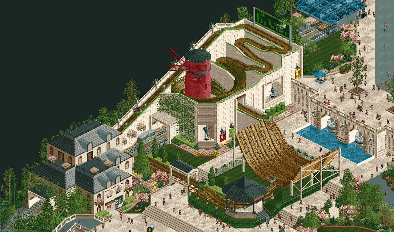
oh wtf dude this is so excellent. Tons of really brilliant moments here. What are you using to make those posters?
You've really managed to make some of these expansion objects look so great in context. The pink of the cherry blossom trees gives this entire area such a nice, tasteful atmosphere. I think you've absolutely nailed the vibe you were going for. Great work man.
Thank you! The posters are from the art deco set with the walls turned invisible. They felt very Moulin Rouge to me.
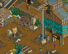
This screen has a really fresh and unique look to it, which is highly commendable considering it is made with what looks to be DKSO objects. It is always harder to innovate aesthetically with limited object choices, so great work there. I don't much negative to say here!
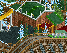
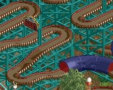
Really interesting ride concept, plus fantastic details all-around! The use of the waterslide track (I think?) as additional perpendicular roof structures stands out to me as particularly clever.
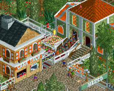
Ride is fun and creative, also really like the object choices. Grey paths looked a little over-saturated color-wise from the palette to me, but the stone colors are spot on, blending all of those base game, add-on and DKSO objects together that well is imrpessive stuff. Nice sign and good foliage too.
 29-May 24

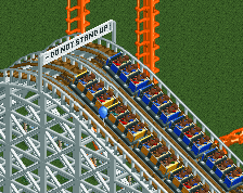
oh wtf dude this is so excellent. Tons of really brilliant moments here. What are you using to make those posters?
You've really managed to make some of these expansion objects look so great in context. The pink of the cherry blossom trees gives this entire area such a nice, tasteful atmosphere. I think you've absolutely nailed the vibe you were going for. Great work man.
Yeah really cool. Unique ride as well.
Thank you! The posters are from the art deco set with the walls turned invisible. They felt very Moulin Rouge to me.
Thank you!
This screen has a really fresh and unique look to it, which is highly commendable considering it is made with what looks to be DKSO objects. It is always harder to innovate aesthetically with limited object choices, so great work there. I don't much negative to say here!
Really interesting ride concept, plus fantastic details all-around! The use of the waterslide track (I think?) as additional perpendicular roof structures stands out to me as particularly clever.
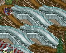
Great screen! Love all the small touches throughout, incredibly skilled stuff.
This is wild dude. Love the sign and the dormers on the lower left house. Feels very fresh
i like the little chode-o-rail
very cute, i loved
what a fun take on that coaster, the sign up top is mint
Ride is fun and creative, also really like the object choices. Grey paths looked a little over-saturated color-wise from the palette to me, but the stone colors are spot on, blending all of those base game, add-on and DKSO objects together that well is imrpessive stuff. Nice sign and good foliage too.