Screenshot / New Entrance Area
-
 30-April 14
-
 Sunset Vista
-

 10 of 17
- Views 3,454
- Fans 2
- Comments 18
-
 Description
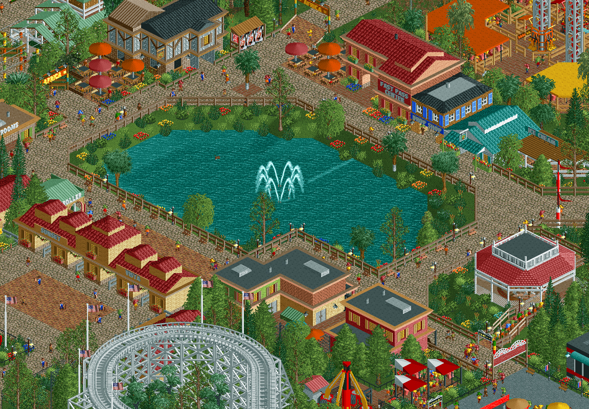
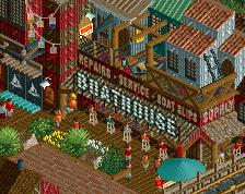
Sunset Vista is a park that's been under construction for almost 2 years now. Throughout the project I feel that I've improved a lot (which is mainly due to the great feedback I've received here and in my streams... so thank you) and because of this I've found myself going back and re-doing older areas of the park to bring them up to the level of everything else.
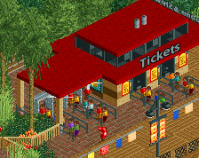
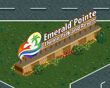
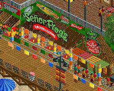
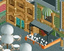
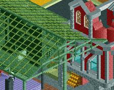
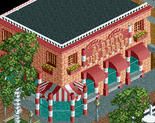
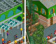
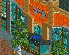
This entrance area is almost unrecognizable from the last screenshot I posted of it. Every building (including the main gate) has been replaced, ride entrances have been removed and queue lines have been re-routed.
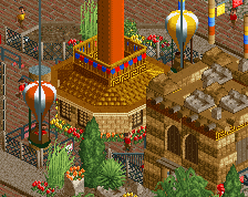
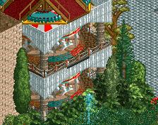
I've also added two signature attractions, the carousel ride and the S&S tower complex which is guaranteed to make a visual impact when guests pass through the gate for the first time. -
 Full-Size
-
2 fans
 Fans of this screenshot
-
 Tags
Tags

And here is the area prior to it's complete renovation.
That's a big (BIG) improvement!
A much better improvement. You should be proud of yourself
wow dude, that's like a complete 180. at first when i saw this area i wasn't really that exited for the park. but now it seems like something to really look forward to
A big improvement indeed. I hate the brown fencing everywhere though. It's higher than the peeps! It's a themepark, not a prison.
Fantastic improvement! That's really impressive progress.
Really stunning I hope to see this released.
What a great improvement. A lovely entrance area.
The improvement is significant...good work.
Thanks for the great feedback everyone! It was a lot of work and I'm happy to hear that it paid off.
Faas, I'll definitely play around with those fences. You bring up a great point.
I agree with Faas. And the foliage seems very random to me, especially around the lake. But it's definitely a huge improvement!
Definitely a significant improvement, but I personally feel as if the fencing around the lake seems a little forced. I'd also change the sloped brick path and make them stairs. Again, mostly personal preference.
The comet coaster got such a great improvement. The only thing I would say is to maybe get rid of the four flags on comet's turnaround (or maybe just move them to a different part of the coaster; perhaps the lift chain?). It kind of diminishes the effect of the flags in the entrance.
big improvement. the colors and details are a lot better. I am not quite sure about the bushes around the lake. they seem too random/scattered.
What an improvement. Like mentioned above the foliage could be worked on and some buildings are missing a bit of refinement, but otherwise everything looks good. I'm really liking this park.
the area itself now is good, now try and make the actual entrance more appealing and inviting...
Everything is a major improvement, except the foliage. What you got looks like you selected a scenery piece and then blindly clicked in a general area. You need to clump together appealing sets of foliage so they look like they have grown naturally, which usually means together, rather then set out.
This part of the park actually could do with some very architrecture foliage, aka, patterns and lots of similar styles. Usually entrances are very manicured, so you can easily do rows of similar flowers and pretty bushes and it doesn't look forced.