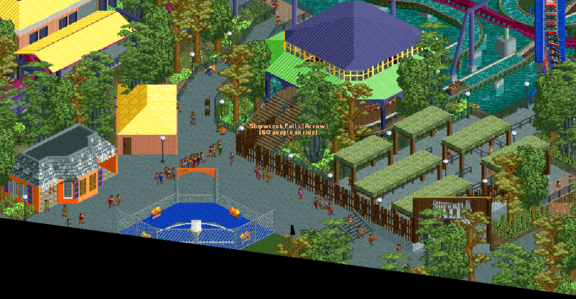
Move those trees so we (as viewers) can see the sign!
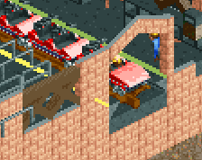
Overall it's fairly nice, but I think you can start adding in more detail in places. The bathroom walls feel very thin, and the interior we see could have an additional quarter wall or something to add more depth to the interiors. The three point challenge could use more detail as well-- add the extra pizazz like signage, prizes, lights etc. Those are big money makers so parks like to dress them up a ton. Keep looking at reference photos and you'll find more and more details like that to add which will help bring your work to the next level.
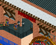
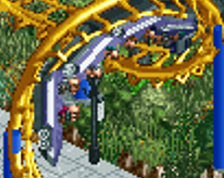
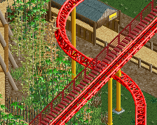
I'm definitely curious to see more of the flume, the technical details on the ride along with all of the interaction make that part of the screen very intriguing!
 14-January 24
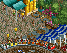
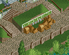
Move those trees so we (as viewers) can see the sign!
Overall it's fairly nice, but I think you can start adding in more detail in places. The bathroom walls feel very thin, and the interior we see could have an additional quarter wall or something to add more depth to the interiors. The three point challenge could use more detail as well-- add the extra pizazz like signage, prizes, lights etc. Those are big money makers so parks like to dress them up a ton. Keep looking at reference photos and you'll find more and more details like that to add which will help bring your work to the next level.
I'm definitely curious to see more of the flume, the technical details on the ride along with all of the interaction make that part of the screen very intriguing!
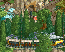
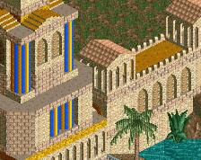
This looks like a park!
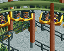
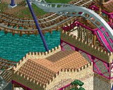
I always think your queue lines and theme park atmosphere is really great, looking forward to this.
wow! love the path layout, feels cozy and rather realistic!