Screenshot / Oni
-
 07-January 24
- Views 1,038
- Fans 1
- Comments 12
-
 Description
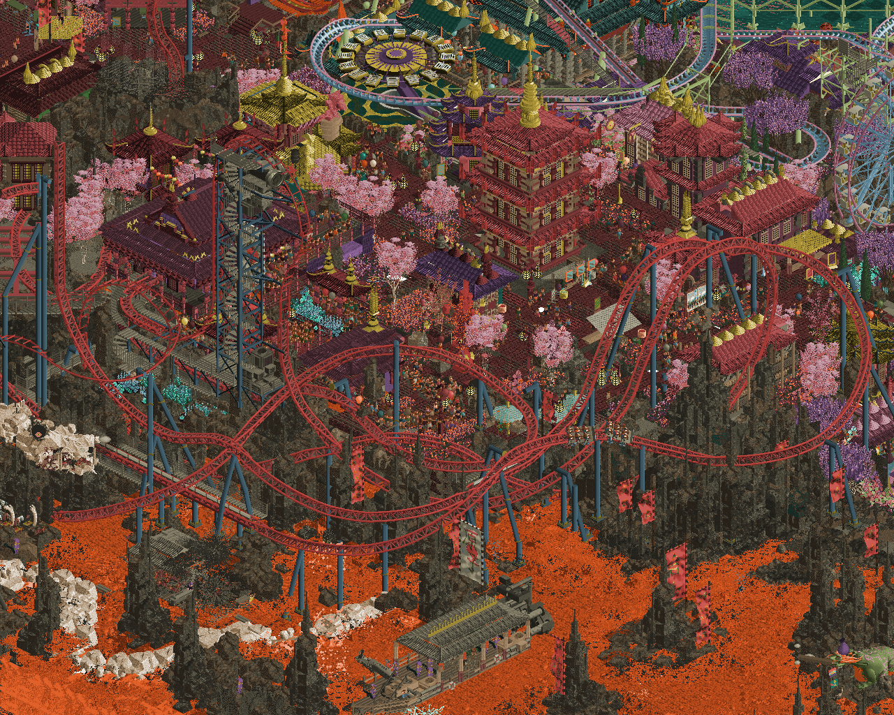
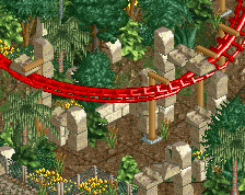
Tried to fit as much of the coaster as possible
This part was a fever dream to build, but felt like another break through for me in the development of my style
a lot of fun tools and techniques went into this im eager to try and experiment further with
Thank you for the positive feedback to the park and the placement, very content with the results of the contest and glad to have participated! -
 Full-Size
-
1 fan
 Fans of this screenshot
-
 Tags
Tags
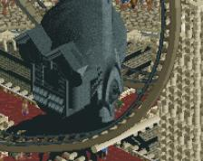
That dragon head tho... wow
Bonkers
A bit too busy for my non-galaxy brain but each individual part is wonderful.
The beyond vertical drop is sooo good.
this is insane! love it so much
Agree with Jens about the dragon head and other sculptures in this map.. purely impressive.
I know it's your style at this point, but some of this can be a bit busy and overtly detailed imo, leaving it a bit hard to find rest or bounce around the screen composition in any meaningful way. It's nonetheless impressive though, and I am curious to see where you'll continue to take it in your next works.
Really great, wow! The use of scenery to simulate the thin-gauge birail track is really novel and well-executed. The layout in general is such a banger, and I love how the coaster is tucked between the fire and the pathways, acting as a sort of border.
Some more spots of contrasting cool accents, such as the blue crystals (?), might help balance out the colors a bit IMO, but that's a nitpick. This looks really cool!
ur a god for this one
If any screen deserves the maximalism tag this is it. Just insane.
Also apologies for only adding the parkmaker level to your account on discord but not on the site yet. I'm running our script for it now.
Thanks all!
Y'all are definitely making good points here! Looking at this now it's still such a fever dream. I was just into it I kind of just let it ride and went with it, went with my gut. I see how it doesn't compose intuitively well for sure. My Texas or Belgium parks I tried to be a bit more restrained, my next park, hopefully maybe my Turkey release, will definitely be more balanced of the two with an extended itinerary.
Also thanks Posix!
I think something that I struggle with is depth. Perhaps its because of colors blending together or because of the shear density, but it's some times hard to tell what is above something, or where the path is. Is that path cover? How tall is that building?
With the lower part of the screen, it's very evident because of the contrast between the dark rocks, the orange lava/water. ,
And I get what Pants and nin are saying. Maybe this is the photographer mindset in me, but what is the subject in this screenshot? Does it stand out from it's supporting cast? Does it blend in too much with the surroundings? Take for example a picture of a football player making a catch. Do I need a high depth of field? Do I want every face in the bleachers to be in max focus? Or more focus solely on the guy making a one-handed catch?
Figured I'd pose these questions as a thought process - not a criticism. Definitely an insane amount of detail/content on display here and am happy to see you finally earn that Parkmaker status.
This is such a good feedback perspective. I try to think of the rule of thirds when I build things but I just kept adding these microgrids of composition that I totally see where it loses focus. In fact, I struggled to frame this screenshot to get the best shot of the coaster. I guess I was just kind of ok with it with the vibe of the park personally, but it's not something I want to continue in my next build. I definitely will be taking these comments into consideration for expected results!
ALso thanks for voting me in as parkmaker! you are def joining me from the fringe club with disney if not elite status or even legendary who knows!
some really good feedback here in terms of focus/more room to breathe etc. cannot wait to see what you make next with that in mind, you're one of the most exciting builders right now.