Screenshot / The Drunk Woodchuck
-
 03-January 24
- Views 976
- Fans 0
- Comments 7
-
 Description
This is the first coaster I build in my yet-to-be named park. The ride sign for it is pretty much the only thing to survive from the first version of the area :p
Right now I'd say the park is about 55% done, but most of the major rides and areas have been planned out. Hoping to finish this somewhere in the first half of 2024.
The map is going to be 161x161. It's my first time building something this large, but it's been a fun process. -
 Full-Size
-
 No fans of this screenshot
-
 Tags
Tags
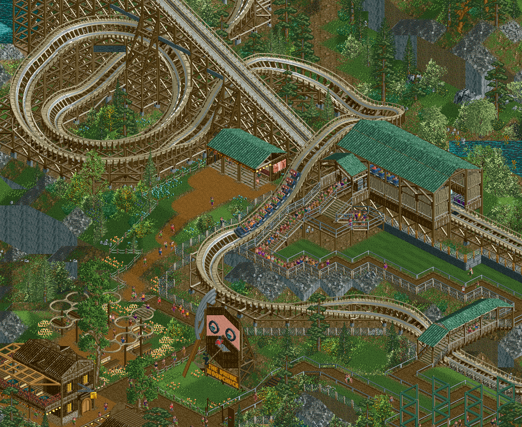
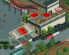
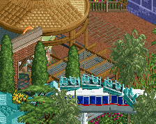
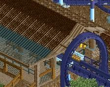
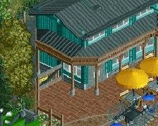
Love that and the theme for the ride is pretty funny/unique. Perhaps a few more beer barrels or brewery style structures to push the theme.
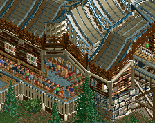
station seems very boring relative to the name of the coaster.. thus I'd do what JK says!
Note taken! The station is definitely outdated and on my list to redo.
That's nice. I love the layering of the terrain, coaster track and paths.
Think the palette hurts this by making it look duller than need be. I believe the wooden coaster would look better with a vanilla bright brown. But I also see how you wanted to blend it all together with the nature.
Other than the station this is really nice, do sorta agree with posix about the colors, not really my favorite but ultimately thats your preference!
Thanks for the feedback
By now the entire station and queue have been deleted and I'm reworking the area, putting the theme in the spotlight more. I was already doubting this station but you guys gave me the push I needed haha
The palette is a hit or miss, I agree that many colours are a bit dull, but I'm using this palette to change the ice walls into a rock colour. That part of the palette works well I think.
i like the layout and the way it turns around the queue. just keep working on this a bit more for detailing