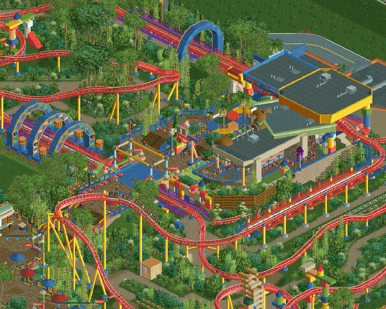
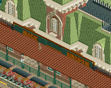
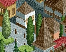
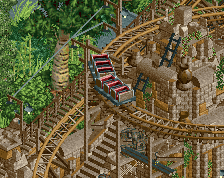
This is incredible... I was hoping we'd eventually see this in RCT2 and you nailed the look.
My only critique would be that I almost think the colors are too muted here. The saturated red and bold green probably would've fit the theme better, but that's a very minor personal preference. Otherwise, amazing job.
Your best work by far. I do agree with Jag though, the palette feels a tad washed out and a bit of extra contrast would make this area stand out a lot more.
Love it! Really love how the peep eyesights have been considered throughout. Don't really agree about the saturation. I think the red of the track gives an easily identifiable streak to follow and the other little notes of the more saturated red show that you've definitely considered the colours throughout.
I just wish the orange accents were around both sides of the arches so that they have a polish no matter what side you're viewing them from.
I see everyone's point about the colours, but I think it's something else that feels a little off. It's the paths, they're too dark. I think going with a light path will make the colours pop more. And what about dark red rails for the coaster?
Great work otherwise! Reminds me of Airtime's pre-Disneyland stuff.
 25-December 23
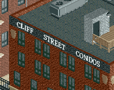
This is incredible... I was hoping we'd eventually see this in RCT2 and you nailed the look.
My only critique would be that I almost think the colors are too muted here. The saturated red and bold green probably would've fit the theme better, but that's a very minor personal preference. Otherwise, amazing job.
Your best work by far. I do agree with Jag though, the palette feels a tad washed out and a bit of extra contrast would make this area stand out a lot more.
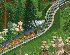
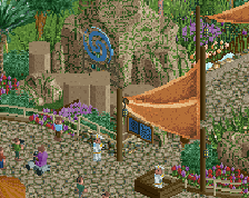
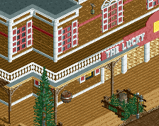
This is really cool. Love it!
This looks like a lot of fun. Nice work otter.
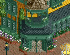
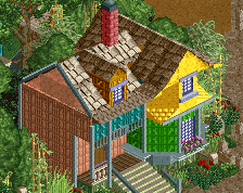
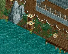
This is awesome. Love the primary colours and the foliage palette.
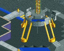
Awesome work.
Love it! Really love how the peep eyesights have been considered throughout. Don't really agree about the saturation. I think the red of the track gives an easily identifiable streak to follow and the other little notes of the more saturated red show that you've definitely considered the colours throughout.
I just wish the orange accents were around both sides of the arches so that they have a polish no matter what side you're viewing them from.
I see everyone's point about the colours, but I think it's something else that feels a little off. It's the paths, they're too dark. I think going with a light path will make the colours pop more. And what about dark red rails for the coaster?
Great work otherwise! Reminds me of Airtime's pre-Disneyland stuff.
freakin love the toy building blocks and all that so much! so creative, love what you've been doing
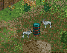
OMG OMG OMG how wonderful, I just saw it, fantastic