Screenshot / Almost done
-
 25-April 14
-
 Century cape
-

 3 of 3
- Views 2,783
- Fans 1
- Comments 12
-
 Description
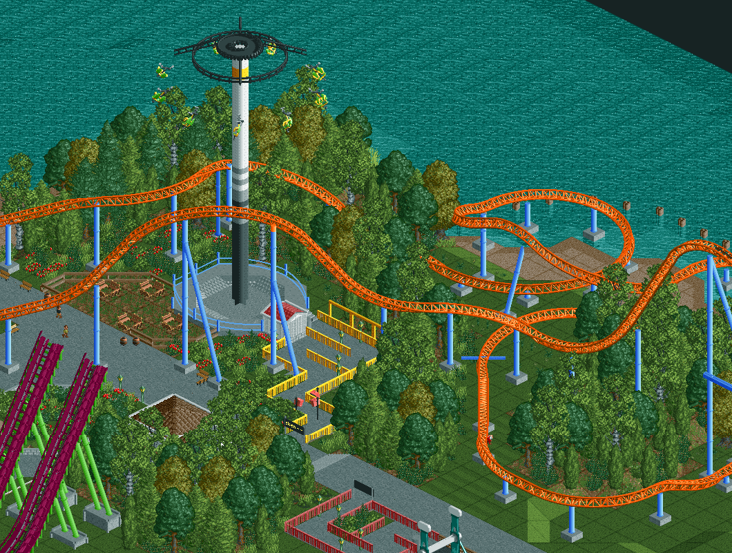
Century cape is now around 30 hours, only about 7 buildings and some fine tuning to make everything a bit more cohesive, then i'll submit it.
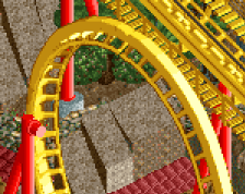
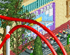
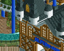
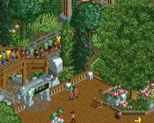
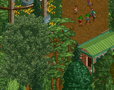
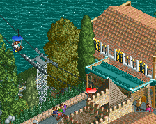
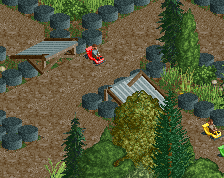
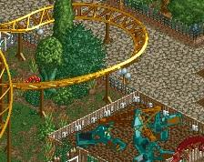
on this screenshot you can see the the drop of the parks main ride, goliath. with the windseeker inbetween. my goal with this coaster was mainly to get enough interaction and i think i did, the coaster goes over the path after the entrance twice, so guests have plenty of oppertunities to decide wether they want to ride it. other than that you can also see a boomerang in the background, but i'll post screenshots of that later. -
 Full-Size
-
1 fan
 Fans of this screenshot
-
 Tags
Tags
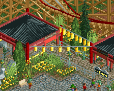
Pimp up your queu lines a bit more. Some cool overhanging things, small roofs or some scenery pieces. Now it looks like a slab of concrete with some fences.
thanks for the advice would a roof like this be good?
also i just noticed that the televisions block the line, i'll fix that too
Yeah stuff like that, maybe a canvas roof here and there. Look at the queue lines in my screens for examples.
Nice! There needs to be some more grass foliage around the trees instead of just bushes. They'd also look better on that roof around the queue aswell. I really like the interaction with that flying attraction aswell, although it does look a bit dangerous.
You should also try to add some extra support pieces to the track, like at the parts where there's a little bit missing you should zero clearance and put one more above in a lighter colour to actually connect it to the track. Besides that, i really like it.
Also make the picnic area next to the windseeker into normal grass. Who wants to chill in the dirt?!
worms faas, worms. also does anybody know how to make nice little realistic shops and stalls? i need to add some small buildings to it to fix the emptyness i'm feeling here
Don't you think it's a little odd that you have a path with no fences, with low coaster track right next to it? Sounds like a lawsuit waiting to happen to me.
I really like the colors here but I agree with Faas about the queue lines. Also, you have a TV through the middle of the Windseeker queue.
This is really nice; it has a great natural feel to it.
Pulling my comment from reddit over.
good progress!
Are you asking for advice, or for some one to work on this for you? As for advice, the best thing I can suggest, is to look at real parks using google street view for inspiration. There's no right way to build