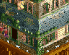
Not pictured: the strip club sign on the other side of the billboard.
This is nice! Details like these create a strong sense of place. I think your style of crunching up these unpaved surfaces is a little rough, too many hard straight lines and square shapes. The textures used are crunchy by themselves, so when it comes to mixing them I'd say less is more. Or more is more if you manage to smoothen and obscure the transitions more.
 20-November 23
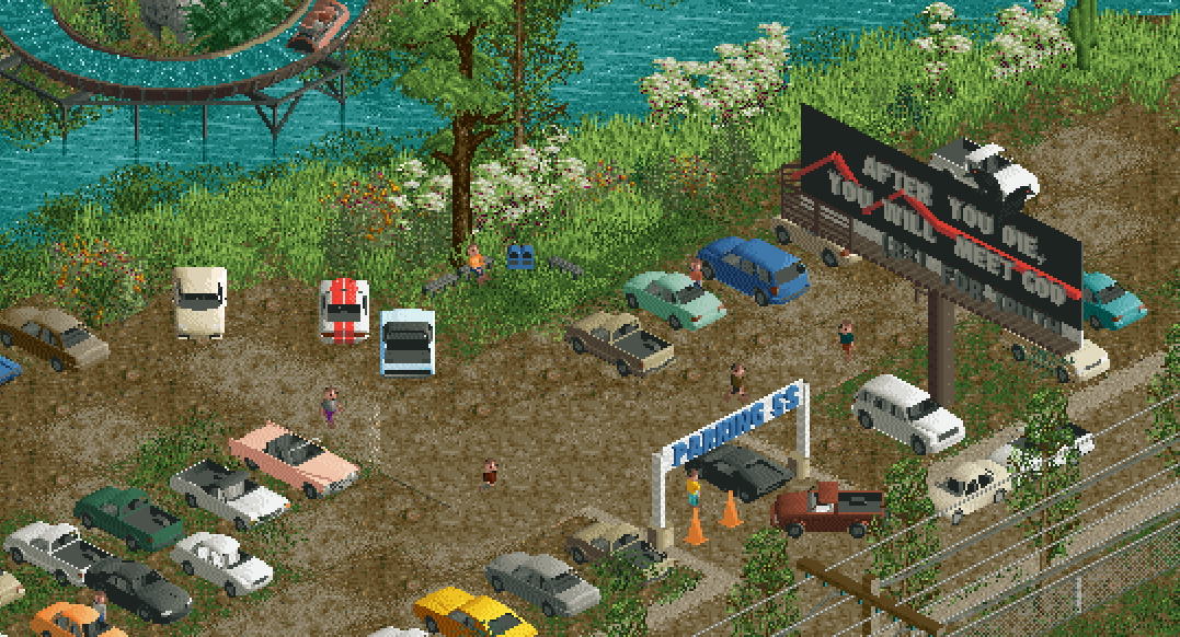
Oh noooooo, not *that* billboard! xD
Not pictured: the strip club sign on the other side of the billboard.
This is nice! Details like these create a strong sense of place. I think your style of crunching up these unpaved surfaces is a little rough, too many hard straight lines and square shapes. The textures used are crunchy by themselves, so when it comes to mixing them I'd say less is more. Or more is more if you manage to smoothen and obscure the transitions more.
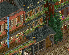
Oh my gosh that's great xD