Screenshot / The Story of Ratatouille
-
 04-November 23
-
 Pixar Animation Studios
-

 2 of 3
- Views 2,163
- Fans 3
- Comments 20
-
 Description
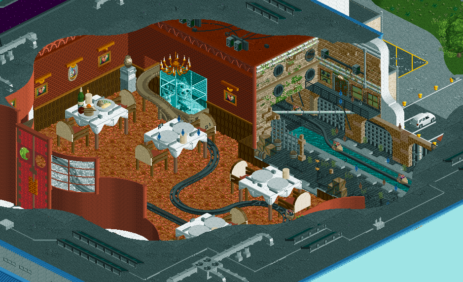
Set mostly in Paris, the plot follows a young rat Remy who dreams of becoming a chef at Auguste Gusteau's restaurant and tries to achieve his goal by forming an unlikely alliance with the restaurant's garbage boy Alfredo Linguini.
Take a trip through the sewers to the kitchens and dining hall of the famous restaurant. Remy and his family won't hold back, and sing to you throughout the whole experience! -
 Full-Size
-
3 fans
 Fans of this screenshot
-
 Tags
Tags
dude WHAT?!
oh wow! this is so freaking CUTE! i am living for this
ah bloody hell this is really great dude. absolutely spot on. love entering the room at that height so they can see everything before dropping down to the size of a mouse between the tables
What a great ride concept, love the giant scale setting.
Beautifull. This is such a great concept and skilfully realised.
skaling is nice because you are the rat i think is the idea of it. is there a kitchen part of the movie too?
Very cool. I love how you've done the look-in.
Only potential complaint for me would be that the interiors look quite technical and a bit stiff. But I suppose that's intentional with the theme and setting.
This looks amazing J K, great work!
Truly fantastic. "Giant" scenery settings are difficult to get right, and this one, yet you've managed to strike the right balance between that and allowing it to look like a realistic ride.
Only detail I'd potentially rework is allowing the shared walls on the sewer side to be a different material from the dining room wood paneling.
I like it! It seems massive.
It's the tables for me
Insanely creative. Maybe a bit much empty space in the middle of the dining room, but that is a very minor nitpick. Another spotlight in the making.
I think the scale is a little all over the place here. Obviously you can't really get around certain scaling with the objects we have available, like the plates, the statue pedestal and the fish tank might need a *little* imagination from the viewer but when you take into account the size of the mice the guests are riding in and see the dining room scene against the sewer scene, they feel wildly juxtaposed from one another. With how big the objects are in the dining room, the pipes and grates and boxes and doorways and catwalks of the sewer don't match the size. Unless there's something I'm missing, the sewer doesn't feel larger than life like the restaurant does.
why are there 3 distinct track styles on this ride?
Super fun and creative.
Overall really cool. Tend to agree with cocoa and Steve. The sewer section seems a bit underscaled compared to the dining room scene. And I would remove one of the 3 track types to clean it up a tad.
Completely agree with both. Track types have been changed to one, and I'm going to address the scale in the sewer theme for sure.
Thanks for flagging guys!