Screenshot / Star Wars Sector
-
 21-September 23
-
 Lizard Point
-

 9 of 25
- Views 1,016
- Fans 1
- Comments 6
-
 Description
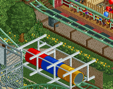
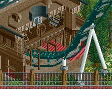
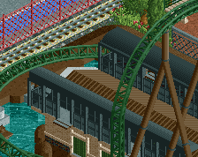
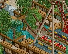
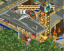
I'm back after a summer of hell with this screen. it's the kiddies area of Star wars sector. there is alot in this screen so i'll start at the top! Droid dasher is the minecart ride with stormtrooper laser blast opened up behind it. At the bottom you can see rogue squadron's simulator building, then escape pod tumbler and to the left rocking road speeders. Which is one long train.
More to come -
 Full-Size
-
1 fan
 Fans of this screenshot
-
 Tags
Tags
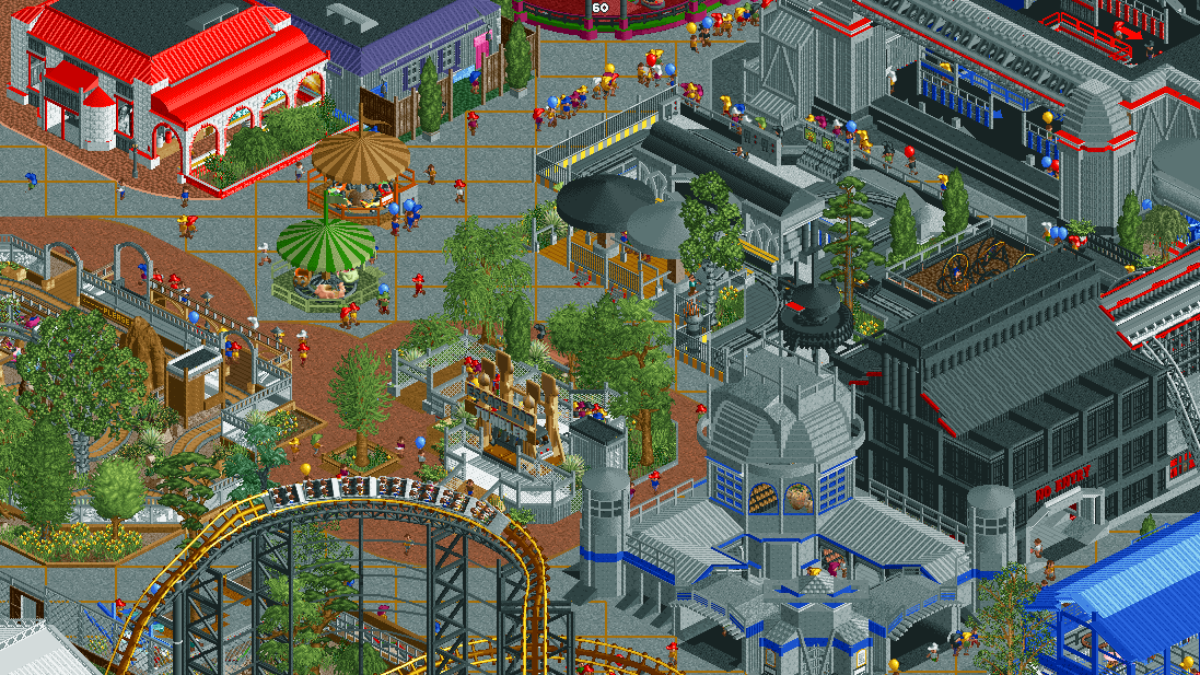
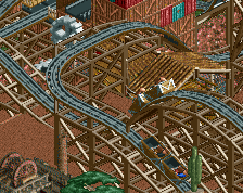
This is cool! Love how the coaster fits in in this area. The red and white building in the top left is a bit ugly though imo. While the gray wooden wall motifs look great the overall shape/colour and detailing on that building just looks off to me.
good to see you!!!!
Good to have you back, hope you're well! All the sci-fi stuff in the top right corner looks great. I have two gripes with the rest of the screen:
- Maybe it's good to replace the peach path with something lighter, less contrasting with the normal grey pavement. With these colourful surroundings it kind of makes the area confusing and lacking depth.
- The green ride awning blends with the foliage. Are brown and green really the best colours you could've chosen here?
There is a sense of excitement and energy to this that really carries it. Some of the structures I think could use some refinement, and the macro is crowded as hell, but the atmosphere and the general sense of fun to the screen is great.