Screenshot / Welcome to Frontierland
-
 14-September 23
-
 Otter's Magic Kingdom
-

 3 of 5
- Views 1,582
- Fans 2
- Comments 10
-
 Description
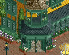
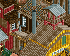
Blaze new trails and explore the final frontier. Either arrive by foot or by train to experience a quirky river adventure, blast your way through the mines of Big Thunder Mountain, or to cool off by catching a joyful show at the Country Bear Jamboree.
-
 Full-Size
-
2 fans
 Fans of this screenshot
-
 Tags
Tags
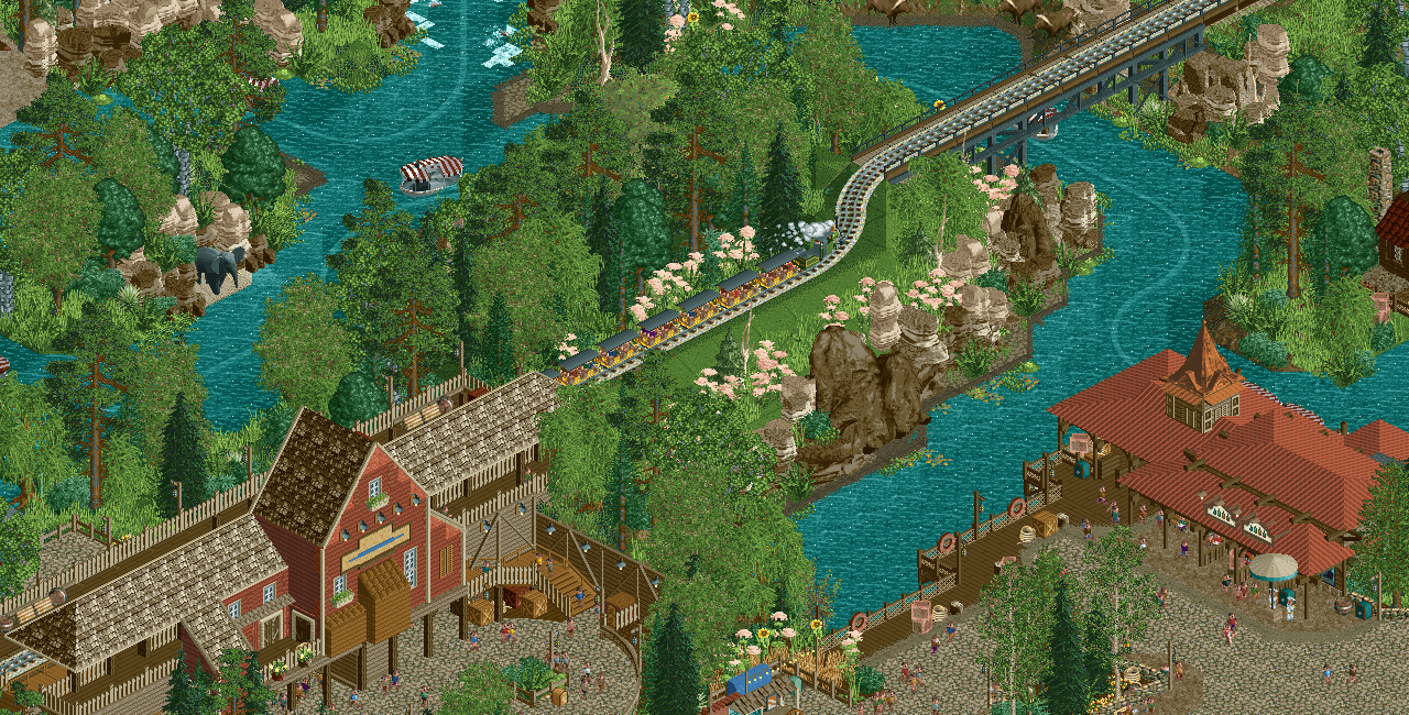
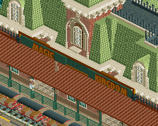
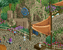
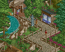
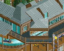
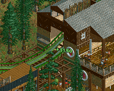
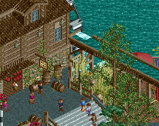
Not a huge fan of those beige flowers (?), they're not reading well and keep the area very muted.
It may also be the shade of brown you're using, but the area doesn't quite have the southwestern feel that is typical for Frontierland (though this could be intentional).
As a whole though, it's quite charming and well executed. Good job, otter.
can you smooth out the angles on the water? everything else is so organic
Lovely screen. I agree with Sammy about the water tho.
more like otter's a lad, amiright
A bit heavy on the foliage. I don't remember frontierland being in a forest.
Edit: Also wanted to add that this just doesn't feel like Frontierland. More like Forest Frontier. Might just need more context though.
Good point. Nor is Jungle Cruise next to Country Bear Jamboree! I hope it will all make sense to everyone in the end.
i think the form of this screen is super satisfying
Kinda surprised at the initial comments this is getting. I mean I get it, we all want to give feedback for a release to be the best it can be, but when I first saw this screen I thought "man I really like this, feels very Disney."
Not to say the commenters above are wrong or anything, I think they make some good points.
I dunno. RCT is getting to the point where the builder needs to decide how much they value having everything curved and grid-breaking vs feeling more like RCT but well-done, if that makes sense. Like, ProTour 2 parks can look really good even without diagonal paths or curved objects, for example.
I've thought about this a lot in regards to the directions RCT is heading. Does the grid-breaking and curves and half diagonals look nice? Yeah, absolutely. Are they a requirement for good work? I'm not sure.
I can agree with nin's comment on colors. And I see where SSSammy is coming from with the water. I don't think it's too forested though. Part of the western frontier was getting through the forests of the midwest before making it out to the plains states. (east of the Mississippi is heavily forested and was unexplored frontier for a some of the time period that Walt was romanticizing in his films and parks).
Sorry for the wall. It's just one man's opinion.
that's wonderful.
I really like this. Would love to see this park finished!
Everyone needs to decide for themselves the level of detail they want to go for. In the end, the most important thing is the builder is happy with it and gets the project finished.
More and more detail can erode people's satisfaction with their own projects and lead to abandonment.
I think it's lovely. I'm a massive fan of this 2023 otter. Not that I wouldn't have been a fan already prior.
I love how this looks both quite majestic and like a laid back American nature reserve. It's so inviting and pleasant.
Did wonder if that line of rocks down to the right of the steam train is a bit tall? But I understand it's meant as a landscaping feature, and it does deliver.