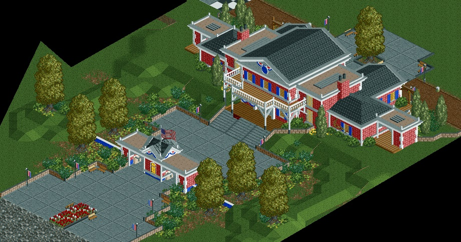
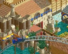
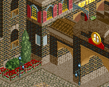
Screenshot / American Adventure Entrance
-
 21-April 14
-
American Adventure
-
1 of 3
- Views 2,645
- Fans 0
- Comments 18
-
Description
After the tragic death of my most successful (and favorite) park, I immediately began working on a colonial-style entrance building. I was thinking of building a very "'Murican" kind of park that takes guests through each of the fifty states, or just a historic/colonial American type of park. But, anyway, I really like how the entrance turned out, but I am not 100% sure on the foliage. I'm trying to decide if this would be one of those "less is more" situations.
-
Full-Size
-
No fans of this screenshot
-
Tags
Realy cool building! Foliage sucks indeed. Variation is your friend.
Edit: I also hate that path type.
Very American.
Agreed that the path sucks. It's also super American.
Great start.
These buildings are great. I especially like the smaller ticket booths. The sections of flat roof work really well on them. Like you say though, I'm not too sure about the foliage either. I don't think it's bad, but perhaps a bit too jungle-esque with regards to the bushes. A few more tree types might help too. Other than that, a great start. Best of luck keeping this one
You could have the concrete square path on the sides and fill the middle paths with something else.
Good start, but not everything right down to the foliage needs to be symmetrical.
I like this a lot.
I think your architecture is great but if I was walking into this park, it would look like I was walking into someone's home. I guess for me it doesn't scream "amusement park". Also, maybe increase the number of ticket booths too. You have great building skills. I just don't know if you are going for a theme park look or what. Great job though.
Hypertwist Offline
MURICA!! FUCK YEAH!!!
composition's weak here, you're bottlenecking the entire entrance through that one building
i'd put a path surrounding the entire building, space the entrance out a little, widen the ticket booths out, and stop using junya boy's path
that one path has destroyed so many atmospheres it's not even funny anymore
The closure of 'The American Adventure' was indeed a tragedy, but with the amount of tickets they gave away in 'The Evening Post' it's little surprise that it died off.
Excellent entrance building though! And just the right scale to reflect 'The [original] American Adventure'
^I don't think this is connected to now, sadly, defunct American Adventure.
Nice entrance though, reminds me of that pavilion in Epcot
Nope...not connected with that park. I totally forgot about "The American Adventure" when I was naming the screenshot.
I like the architecture, only thing I'do is make a bigger ticket booth. That one looks too little for handling the crowds... The gray path is ugly, please get rid of it.
Am I the only one who has spotted a hidden Mickey?
The architecture is really good, but i am not a huge fan of the tiny quarter block landscaping.
wahoo...you caught me. I am a ridiculous Disney fan at heart!