Screenshot / The Rift
-
 18-August 23
- Views 1,362
- Fans 2
- Comments 12
-
 Description
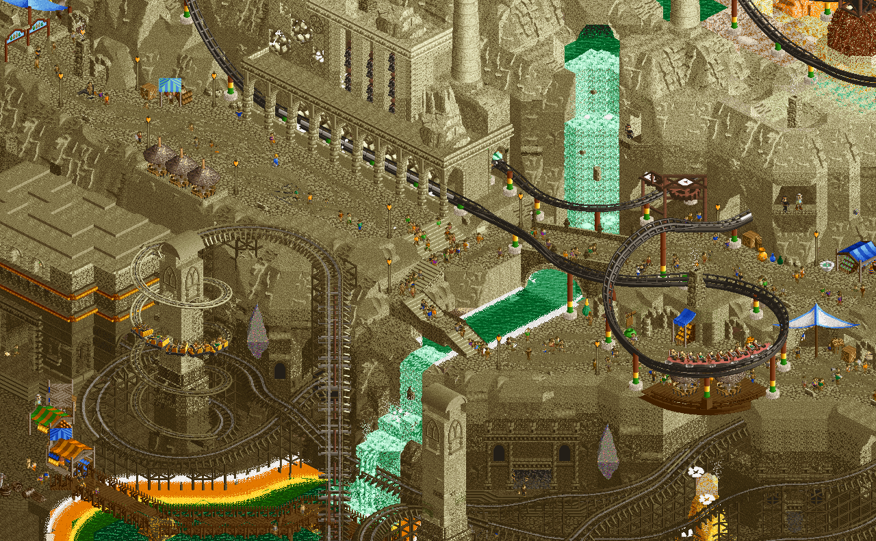
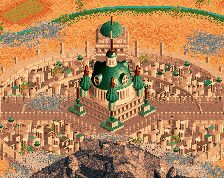
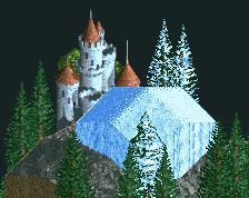
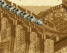
Amidst the hottest location known to man lies the Great Rift Valley. A refuge from the heat and a source of geothermal energy which man is more than willing to tap into.
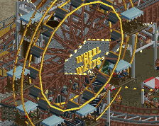
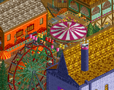
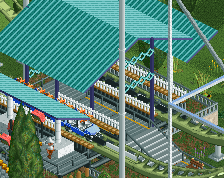
Thank you all for the love and support over the last month. This park finished 3rd out of 7 entries in round 3 of the Grand Tour, far better than I expected it to do. Big props to Version1 for his pivotal 15%, including most of the market stands, the Intamin supports, and the elevator queue in this screen. -
 Full-Size
-
2 fans
 Fans of this screenshot
-
 Tags
Tags
Underrated.
Most underrated builder on NE
The gradient is so good, helps make the area feel more grand and I love the whole sci-fi/ fantasy feel to the structures built into it.
Your dedication to building the "hard" thing is really admirable. The layering of the landscape, the details needed to sell a more complex concept, and the unorthodox ride design shows me that you're really committed to improving. I think you executed this fairly well; loved to see how it would have ended had you had more time on your hands.
Great park, good job Gustav.
I know you wanted to play with gradients, and you've done it really nicely. I still think it's too monochrome to be honest. The individual colour feature highlights are amplified due to the offset of course, but overall the balance is too one-sided for me.
That said, this kind of work is an excellent area to explore, as it's quite unlike what most other people are doing, and I love it when people listen to their own voice.
I wanted a lot more natural and broken-up rockwork in this map but time crunch really got to me. I started off with a lot of intricate shapes and textures but had to fill out at least half the rockwork in the rift in the last week. One extra week or a partner jumping on earlier and we could be looking at something completely different.
Was making it a point to focus more on what I would do rather than what seemed "correct" after a very derivative-feeling Micro Madness entry so I'm happy it came across. Thanks!
So happy to see you nailed this and dug deep to get this finished. You have a really great way with your landscaping, textures and fades that always makes an impressive / evocative viewing. The final drop on the coaster was sublime!
honestly? ate