Screenshot / Skyliner & Whippoorwill
-
 05-June 23
-
 Skyliner
-

 2 of 2
- Views 2,176
- Fans 2
- Comments 13
-
 Description
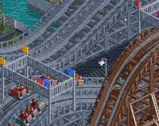
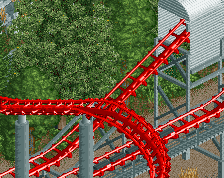
The far turnaround of Skyliner, known as the "fan curve", is infamous for it's hard lateral Gs. The forces are so strong, some riders have reportedly suffered cracked ribs from the curve. Although these claims are decades old at this point.
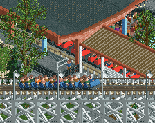
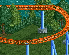
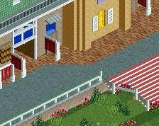
Whippoorwill is a prototype version of the famous Traver Tumble Bug ride. This version is smaller but perched on the hillside for great views and thrills. -
 Full-Size
-
2 fans
 Fans of this screenshot
-
 Tags
Tags
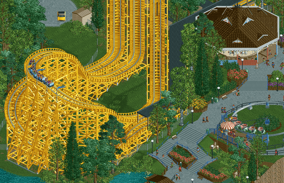
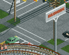
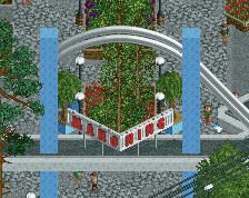
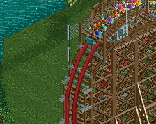
You always know how to make this type of generic parkmaking interesting and pretty, you add just the right amount of detail and character. The coaster being yellow is an example of that. One simple change and the entire thing looks fresh again.
We haven't seen a lot of functional Bugs despite them being such a 20th century staple. You've done a solid job with the vehicle choice, as well as the banked single rail track to give it that angular look.
It appears you're continuing your trend of expertly translating classics into RCT, working around the limitations while still including the iconic parts of the original designs. You did it with Mr. Twister and now here with the Idora Wilcat; down to the final dive through the understructure and the curved brake run around the carousel.
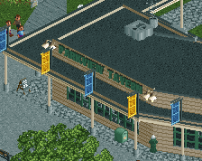
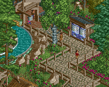
The brick planters and multicolored flowers look sharp. It has a lot of breathing room, unlike the real life counterpart but Idora didn't have much iconic architecture so the natural setting works. I notice you opted not to include the flume ride. Probably for the best as that's where the fateful fire started. You did include some fire hydrants, too bad their real life counterparts didn't function properly (allegedly).
I know jack shit about American coasters, but I do know that I agree with Liam in that you always know to breathe new life in insert catchphrase about realism in America here'. This style lends itself for crunch overload, but you manage to keep it in check, keeping it clean enough but adding just the right amount of texture.
I like everything - but the coaster colors. Colored woodies never look good imo, with an exception for white.
this makes me really excited to see this- i do subscribe to maximalist crunch culture but find this super enjoyable. i personally struggle with planters and theses are super successful.
However I am not super convinced by the trees? For example between the coaster and path stairs, the three different trees right next to each other is cool, but it looks like you're trying to block the view for the peeps but you use denser landscaping elsewhere.
I personally find the yellow is so striking and inspiring! from what ive seen the layout looks cool. huge woodie fan as always!
Download link?
@AJ & Jappy - It was definitely intentional to reduce the crunch here, not only to portray an earlier era before things might have been very rundown, but also to make the build more enjoyable. Glad you like it. A
@AJ - As for the trees, perhaps you have a point, I guess a park like this probably wouldn't have really paid much attention to that sorta thing and just let the trees grow up wherever they were. Adds to the mystery and concealment of the coaster a bit maybe, rather than creating these sightlines more typical of a large modern theme park. I did take these things into account though, it's not purely random, there is some craft I think, but it's also intentional a bit random and meant to feel natural.
@Verbisback - Hopefully soon! The park was submitted and should be released before too long.
So cool. I love how this straddles both modern realism and what i see as RCT's natural aesthetic (embracing ramped hillsides, single tile paths, default woodie supports)
I think the three trees in a row look a bit "plopped down" too much. Like they are floating.
Realism too often means making everything brown and white, but the yellow coaster really adds a lot of fun to this screen.
I like how this screen is almost 'aggressively normal,' and then there's this eye catching ride, smack-dab in the middle of it.
Love the yellow.
This has an elegance to it that only you're capable of.
you are top 10 parkmakers of all time here.