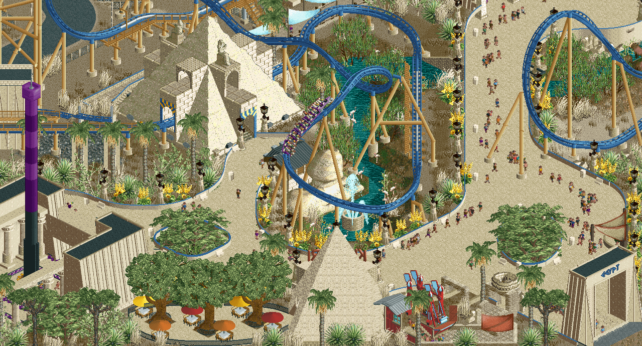
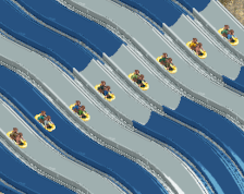
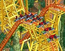
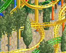
Fucking love it! Coaster colors are great, coaster looks very flowing. I would go with a more textured path, right now the path goes a bit too much up in its environment.
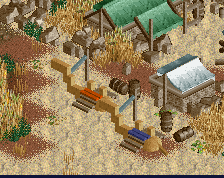
I'm gonna be the dissenting opinion here and say that you don't necessarily need to add crunch to make this look better. I think it looks pretty wonderful as is. My counter-suggestion would be to add more colorful awnings (I see you've got one there, but it's also tan) and path features to break up the tan and add some pops of color here and there. The coaster track, drop tower, and other rides do a good job of it - but I think some path life will add an extra level to it!
It's not so much adding crunch for the sake of adding crunch. The foliage is already doing a great job adding the crunch factor. Adding a more worn down path makes it feel like a real place - worn down by time and use. Gives it that grounded look. I don't disagree with adding pops of color with colorful awnings and path features - I just think that maybe some little pieces of stone pathways blended here and there would be a good alternative to strictly sand.
Nice screen. I think the path blending in too much has more to do with its colour than necessarily a lack of texture. It has the same colour as all the walls and other details. I would just change the whole path colour if I were you, maybe to something a bit darker. I love the architecture though!
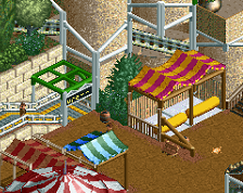
The one thing I don't like is the seating area at the bottom of the screen. I'm unsure if the issue is the trees, the benches themselves or perhaps the path texture but I don't feel like it's matching the overall quality of the rest of the screen.
The one thing I don't like is the seating area at the bottom of the screen. I'm unsure if the issue is the trees, the benches themselves or perhaps the path texture but I don't feel like it's matching the overall quality of the rest of the screen.
Agreed, I think it's a combination of things, but the quality of objects there really is what's brining things down I think.
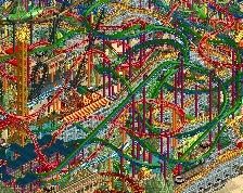
Lovely, lovely stage-setting and great path interaction everywhere.
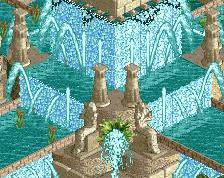
The Sphinx placement is a bit questionable, facing away from the path and kind of under the coaster - would be better closer to the track at it's low point to give the riders the sensation of a near-miss, or rotated and moved a bit to face the "EGYPT" gateway so guests would see it looking at them when walking into the area.
I suppose crunch added to the path is one way to go or choosing a darker path without the crunch is another way. Seems any rules determined by the artist and adhered to throughout the entire work is more important than realism or semi-realism or sticking to the meta or which ever. I personally like the idea of a darker path and no crunch because the paths really look good here as clean and moving the eyes to the more important aspects. If I were to build a park again I might complete and use a rule book I began and use paths as negative space or breathing space. And go with simplicity. There’s beauty in simplicity. It grows on you. And a personally created meta would ensure a more timeless quality rather than the next park outdoing the one before. I guess that’s my philosophy anyways. Great screen. Love the custom lamps, too.
 01-April 23
So good
i really like this.
i think you could try adding some crunch to the path to make it even better
Fucking love it! Coaster colors are great, coaster looks very flowing. I would go with a more textured path, right now the path goes a bit too much up in its environment.
So excellent.
I do agree with RWE - that would be my biggest suggestion. Try to incorporate some of the cracked stone pathwork here and there
I'm gonna be the dissenting opinion here and say that you don't necessarily need to add crunch to make this look better. I think it looks pretty wonderful as is. My counter-suggestion would be to add more colorful awnings (I see you've got one there, but it's also tan) and path features to break up the tan and add some pops of color here and there. The coaster track, drop tower, and other rides do a good job of it - but I think some path life will add an extra level to it!
It's not so much adding crunch for the sake of adding crunch. The foliage is already doing a great job adding the crunch factor. Adding a more worn down path makes it feel like a real place - worn down by time and use. Gives it that grounded look. I don't disagree with adding pops of color with colorful awnings and path features - I just think that maybe some little pieces of stone pathways blended here and there would be a good alternative to strictly sand.
Wonderful work!
Diagonal pyramid is really skewed lol
Great screen!
The one thing I don't like is the seating area at the bottom of the screen. I'm unsure if the issue is the trees, the benches themselves or perhaps the path texture but I don't feel like it's matching the overall quality of the rest of the screen.
this is wicked sick man i freakin love it, coaster is one of the best ever
Agreed, I think it's a combination of things, but the quality of objects there really is what's brining things down I think.
kinda looks compacted
love the diagonal pyramid dude
Lovely, lovely stage-setting and great path interaction everywhere.
The Sphinx placement is a bit questionable, facing away from the path and kind of under the coaster - would be better closer to the track at it's low point to give the riders the sensation of a near-miss, or rotated and moved a bit to face the "EGYPT" gateway so guests would see it looking at them when walking into the area.
RaunchyRussell Fan Offline
You crushed this thing. Great work!
I suppose crunch added to the path is one way to go or choosing a darker path without the crunch is another way. Seems any rules determined by the artist and adhered to throughout the entire work is more important than realism or semi-realism or sticking to the meta or which ever. I personally like the idea of a darker path and no crunch because the paths really look good here as clean and moving the eyes to the more important aspects. If I were to build a park again I might complete and use a rule book I began and use paths as negative space or breathing space. And go with simplicity. There’s beauty in simplicity. It grows on you. And a personally created meta would ensure a more timeless quality rather than the next park outdoing the one before. I guess that’s my philosophy anyways. Great screen. Love the custom lamps, too.