Screenshot / Entrance Area overview
-
 15-April 14
-
 Vitaminland
-

 17 of 21
- Views 2,038
- Fans 1
- Comments 9
-
 Description
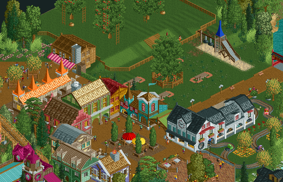
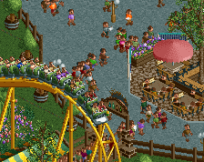
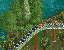
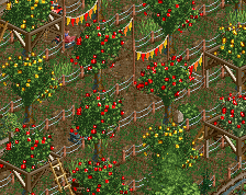
When entering the park, you will be at the busy square of Vitamin Village, a calm little village where everyone eats and drinks healthy. To the left of the square you can take a ride on Orchard Racers and experience a day in the life of a produce grower! Or pay a small amount of money and pick your own apples to eat up during a comforting picknick.
-
 Full-Size
-
1 fan
 Fans of this screenshot
-
 Tags
Tags
So cute.
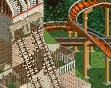
On the one hand, I absolutely love it. The colours are fantastic, the overall composure of the screen is amazing, the little slide is great, and the orchard is very neat.
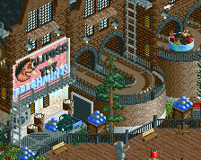
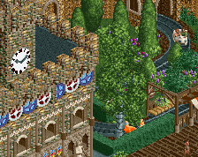
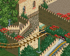
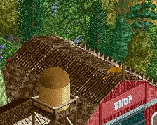
On the other hand, in an architecture focused area, I don't think the buildings are detailed enough. The buildings are nice on first glance, but there's nothing to make me look back at them. There's no details on there that make me think 'Wow, that looks nice!'. Even at the path level, there's nothing really that would stimulate a persons senses. Every building is made from the same composition of arches on the path level, then a layer or two of windows on a flat wall. I don't think that this is something you'd want to change in this park, but in your next park I'd really like to see your architecture progress a little bit, just where you include a few more details. The way you use your colours and your building style seems very very similar to Cocoa, just on a smaller scale, so I'd suggest looking at the details he adds to his architecture, even if it's just putting a thin wall on the building to add a bit more depth to an otherwise flat wall.
But yeah, the actual composition of the architecture is the only thing that lets this down, although I'd still rate it at about a 70 - 75%. It just has the potential to be 80 - 85% at least if you change the architecture up a bit.
So cute and atmospheric, love the fruit trees getting picked
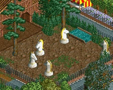
that being said, your work still has such weird proportions. The playground is as tall as most of the buildings.
Adorable <3
Agreed with FK. The scale of the buildings reinforces the "cuteness" but then the trees and playground are absolutely enormous. Great use of open space, though, and I like the colors.
The car ride is so cute!
I don't know... I feel like I should love this screen and everything is great technically but for some reason I don't like it as much as everything else. I love the entrance, I love the little white tables and the main square area is great but I don't care for the playground or apple orchard and I can't put my finger on why that is. It's not that I have a problem with open spaces but here they just seem very plain.
Maybe some apples on the ground and more growth under the trees would help... you rarely fined perfectly manicured grounds in an apple orchard and you always find a ton of fallen apples. If you do an image search for "apple orchard" you'll see what I mean. They're everywhere.
This is really good but I don't think it's as good as the other screens from this park.
Everything is cute, but I can't help but feel the open grass area dominates the screen too much. It's the first thing I noticed, but I think it could look better with just a few small patches of bushes.
The apple trees are fantastic! Personally it feels a little too open for an entrance; but then again given the theme it makes sense here.
Very excited for the release.