A Fallingwater style station, for a river rapids. Awesome idea. Love what I'm seeing in this park overall, Frank Lloyd Wright is a great inspiration for RCT.
We've seen a few Falling Waters in RCT, but this may be my favourite. It works so well as a rapids station somehow. The only thing I don't really like is the path texture(s) you chose in the background.
Really liking this including the waterfalls coming off the back of the station. The vertical glass and that interesting rock texture really helps it stand out.
Indeed, Kai's version on the Masters Palette was one of my inspirations for the park.
The only thing I don't really like is the path texture(s) you chose in the background.
I admit the dark gray path doesn't always look great but it's a primary feature of the design, forming a geometric motif throughout the entire park. An Original Sin, perhaps.
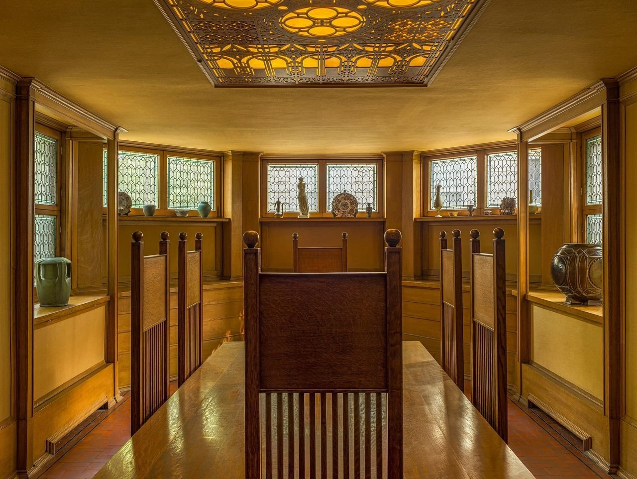
The gray path layout is the circle in the middle of the ceiling tile in this photo. The park is a circle:
A Fallingwater style station, for a river rapids. Awesome idea. Love what I'm seeing in this park overall, Frank Lloyd Wright is a great inspiration for RCT.
We've seen a few Falling Waters in RCT, but this may be my favourite. It works so well as a rapids station somehow. The only thing I don't really like is the path texture(s) you chose in the background.
This is really nice, although I don't get why the grass is grey? Especially the right side of screen is cool with the waterfalls and bridge.
Great stuff
Really liking this including the waterfalls coming off the back of the station. The vertical glass and that interesting rock texture really helps it stand out.
Indeed, Kai's version on the Masters Palette was one of my inspirations for the park.
I admit the dark gray path doesn't always look great but it's a primary feature of the design, forming a geometric motif throughout the entire park. An Original Sin, perhaps.
The gray path layout is the circle in the middle of the ceiling tile in this photo. The park is a circle:
this is really lovely, so fun!