Screenshot / Arcosolia: Entrance Area 2
-
 06-February 23
- Views 1,741
- Fans 1
- Comments 7
-
 Description
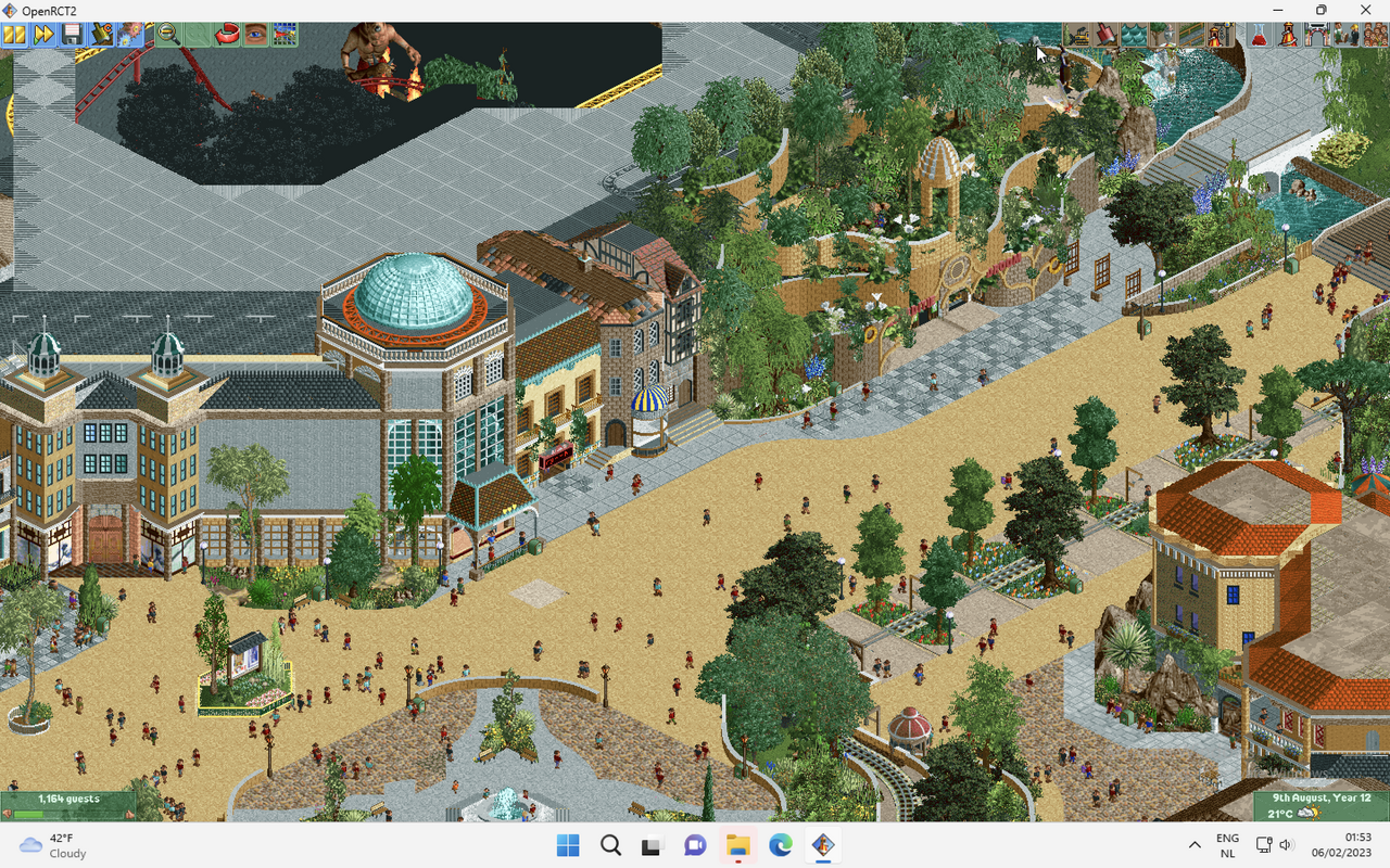
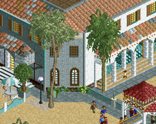
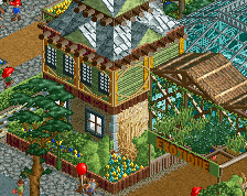
Part of the entrance area for a mixed European-style park called Arcosolia, situated near a fictional European, probably Mediterranean, city.
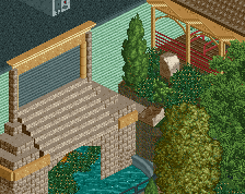
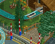
The entrance area has one dark ride (Expeditie Droom) which has a general fantasy forest theme. :)
Visible are:
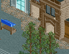
- Part of a restaurant
- Dark ride 'Expeditie Droom'
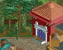
- 'Casa Sal' with its orange roof
- Part of 'Plaza Sal', the main square.
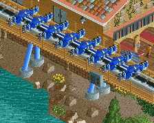
- Railway -
 Full-Size
-
1 fan
 Fans of this screenshot
-
 Tags
Tags
Dang this is cool. Love the overall color palette and atmosphere.
Piece of Cake! I´ll see if it helps
Very nice. Good macro and large scale building. A very welcome sight.
Path choice shouldn't work on paper but you've mixed it up really well! Some of the buildings in front of the dark ride are great!
woah thats super impressive! love the scale and layout a lot! would love the tram ride