Screenshot / Rangitikei River Wild
-
 22-October 22
-
 The Lonely Planet
-

 3 of 10
- Views 1,409
- Fans 1
- Comments 7
-
 Description
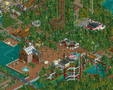
Here at River Valley, exploring rivers is a passion. Since 1982 that passion has found expression taking people down rivers in rafts. River Valley is based in a beautiful and remote setting, beside the Rangitikei River, on the North Island of New Zealand.
-
 Full-Size
-
1 fan
 Fans of this screenshot
-
 Tags
Tags
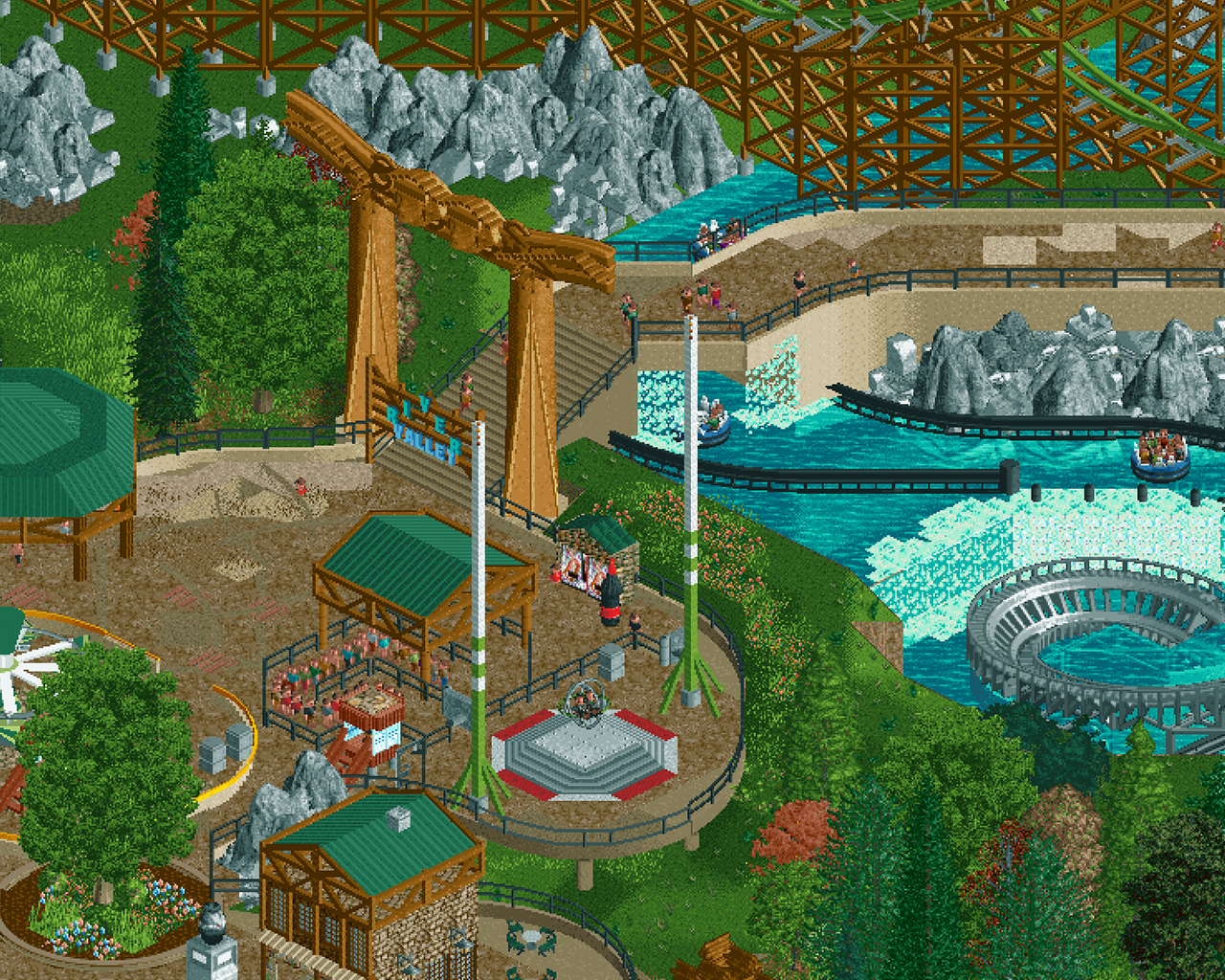
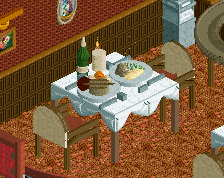
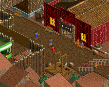
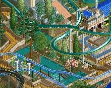
That gate and sign is pretty damn epic. Also loving the coke bottle, such a J K detail
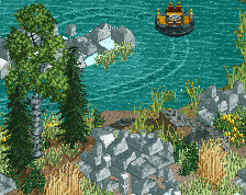
Not feeling the landscaping though... The clumps of rock sit on top of the landscape, rather than being the landscape. And the first thing the path does after a sign that says 'valley', is going up. Foliage in strange colours isn't helping.
To me it looks like you're so enthuasistic about the park (rightfully, I love the plan) and rushing forwards that you're barely keeping up. Just going until you've filled the map, and then tracking back to refine everything you've done could be a legit strategy?
^ Iterative design is legit a strategy yes. This type of building has allowed me to get a lot of my vision down fast, now it's just layering even more detail, ideas and micro down, now the macro is achieved. I'd say every screen I've posted is round-about the 90% mark just so I can get other players opinions and refine further.
Landscaping and pathing work does need a bit of refinement for sure. Thanks for your comment Liam
Interesting contrast on the sign of having the word river form a peak instead of a valley. I think the sign fits better off the path though since you already have the giant gate to symbolize the entrance.
loving this project!
Dark Horse – I didn't even think of that, such a good point, I'll try it out regarding the Valley > Peak and get it moved. Thanks for your comment.
AJ – Thanks mate, it's really inspiring me.
That huge wooden gate is awesome
The LOTR rocks feel a bit floaty, or not integrated into the landscaping as much as they could be, but otherwise very pleasant. Really dig the massive sign and coaster backdrop.