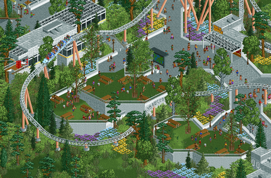
Very cool. I really like this project as a whole. Tritone flowers are great, and elevation is superb. Not sure about the coaster colors though. I like the peach supports, but I'm curious to see a different color track.
A bit too much white for my liking. Perhaps changing the coaster track color would resolve this issue. Also, the rubbish bins on the terraces seem to be in odd spots. I think placing them in between the tables instead of directly behind them would be a better location.
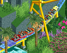
Good to see a new screen of this project. Pretty cool overall, I like the different layers of height and the coasters that flows through it. I think you should repaint the track though, there's already more than enough white in the background so the coaster blends in a bit too much imo.
This is really great. I agree with others that maybe it is a bit too white and that repainting the coaster could be a good idea. On the other hand I do think it being a bit too white fits this particular style, so even if it doesn't look the most aesthetically pleasing it does fit, if that makes sense.
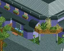
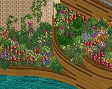
Love this park, Liam. I think the flower beds could use some work here, though. The color transitions are rather harsh - straight lines. I've got the same issue with the pavement and grass. When do you see these hard lines in real life? Composition wise it's a great area, but I think a player of your calibre could get more out of it with better texturing and coloring.
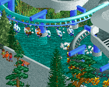
Thanks guys! I understand the comments on the white track, but I'm quite confident it should stay white. I was less confident on the peach supports, so it's reassuring to not get any complaints there.
@posix: I will look into the bottleneck again... Maybe it's not such a crime to have a footer on the path there. It's kind of strange how the planter bulges out. It's alright in the general park layout, as this plaza is kind of a dead end for the main path layout - it's only small paths beyond this point. So you can argue it's not really a bottleneck. Anyway, I will look into it.
@alex: no palette! This is a quite traditional park. No palette, no curves, no half diagonals. SV6 even.
@Sulakke: see above. I can do better in places, I see an opportunity to make the path transitions better. But the octagonal grid is by design!
@Dark_Horse: thanks for looking out to me, do not worry though. That is my account.
Got a very welcome breakthrough on my park again... Demolished a major coaster, and built it back bigger and better. Excited about the progress and having something to show again.
 21-October 22
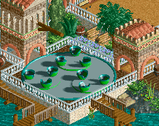
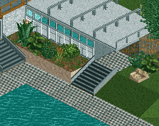
Very cool. I really like this project as a whole. Tritone flowers are great, and elevation is superb. Not sure about the coaster colors though. I like the peach supports, but I'm curious to see a different color track.
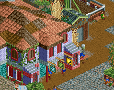
Very cool. Greenery is a feature. I like how you're keeping the uniqueness up with this. Can't be easy.
Can't decide on the narrower diagonal path bit on top. Looks a bit like a bottleneck.
I am fan of this! I love the modernism.
same
Great screen Liam! And do i notice a palette? Somehow the grass looks slightly yellower, and the greys too.
Composition, interaction and support work are all so good. Love how clean this looks too.
A bit too much white for my liking. Perhaps changing the coaster track color would resolve this issue. Also, the rubbish bins on the terraces seem to be in odd spots. I think placing them in between the tables instead of directly behind them would be a better location.
Good to see a new screen of this project. Pretty cool overall, I like the different layers of height and the coasters that flows through it. I think you should repaint the track though, there's already more than enough white in the background so the coaster blends in a bit too much imo.
This is really great. I agree with others that maybe it is a bit too white and that repainting the coaster could be a good idea. On the other hand I do think it being a bit too white fits this particular style, so even if it doesn't look the most aesthetically pleasing it does fit, if that makes sense.
Liampie, are you TrojanHorseMeat on Reddit? If not, someone is trying to pass off your work as their own.
Thanks guys! I understand the comments on the white track, but I'm quite confident it should stay white. I was less confident on the peach supports, so it's reassuring to not get any complaints there.
@posix: I will look into the bottleneck again... Maybe it's not such a crime to have a footer on the path there. It's kind of strange how the planter bulges out. It's alright in the general park layout, as this plaza is kind of a dead end for the main path layout - it's only small paths beyond this point. So you can argue it's not really a bottleneck. Anyway, I will look into it.
@alex: no palette! This is a quite traditional park. No palette, no curves, no half diagonals. SV6 even.
@Sulakke: see above. I can do better in places, I see an opportunity to make the path transitions better. But the octagonal grid is by design!
@Dark_Horse: thanks for looking out to me, do not worry though. That is my account.
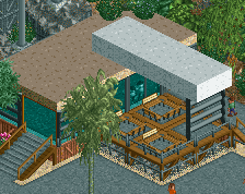
Love the foliage!
The more you look at it, the better it gets.