Screenshot / Lizard Point
-
 29-September 22
-
 Lizard Point
-
 1 of 25
- Views 1,349
- Fans 1
- Comments 9
-
 Description
Hey Peeps,
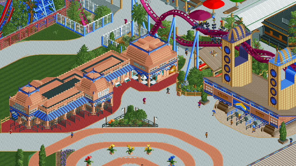
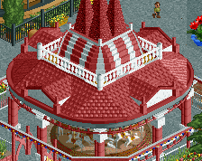
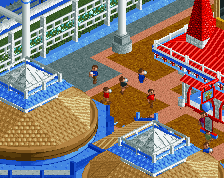
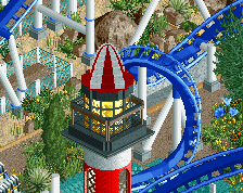
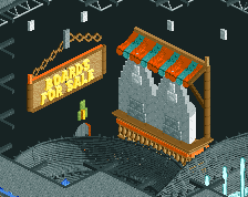
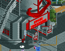
Been on hiatus, but I'm back with lots of screens in the bank. Finally settled on doing this park; Lizard Point. The Cedar fair family is coming to Cornwall, England.
This is going to be my version of cedar point and here is the entrance plaza.
Lots more to come -
 Full-Size
-
1 fan
 Fans of this screenshot
-
 Tags
Tags


very glad to see you back buddy!
I know, been a while, bloody life!
Nice, welcome back mate. Always good to see a British builder
I love this, under the umbrella of realism but still distinctly you
I think you should go more all out with the towers! The tops just feel oddly thin. Nice overall, the grassy area is nice.
So nice to have you back indeed. This looks amazing. Very clean but still warm architecture, and I love the overall vibe.
Looks like this is more spaceous and well planned than your previous work, which excites me. Good stuff.
Faas, on 01 Oct 2022 - 12:40 PM, said:
Yeah, think the entrance sign path needs to be salmon as well. Also I'll thicken up the front Keyhole wall.