Screenshot / Slot Swaffelhoeve 1988
-
 07-April 14
-
 Slot Swaffelhoeve
-

 3 of 28
- Views 2,380
- Fans 0
- Comments 14
-
 Description
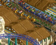
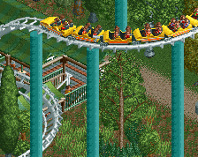
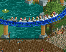
This year, our new wooden roller coaster 'De Pijl' (the arrow) opened. Residents of the nearby village of Slappekoek have started complaining and rioting due to noise complaints though. We decided to let local residents ride the rollercoaster first and to give them a free year pass for the park. However some people are still really angry.
What will happen next? -
 Full-Size
-
 No fans of this screenshot
-
 Tags
Tags
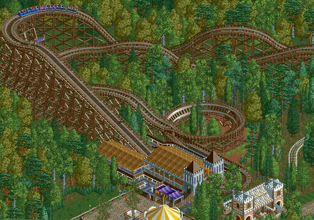
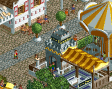
I like how dit looks. The station looks a beetje plain though.
that's you get when you live in slappekoek, that's what you call a 'slappehap', also this really makes me wnat to build my own timeline park, but starting out with a local themepark oud valkeveen which has a record 1 kiddie coaster total
Town residents don't like noise so they're rioting? That seems counterproductive. Make sure you don't serve beer in your park if your customer base is that out of control. lol
Nice coaster by the way. I love your wood coaster style, most people on NE like to have drawn out hills while you go with traditional hills (steep sections followed by one 45 degree section and then a crest). I always thought that looked much better, though it's a matter of personal taste obviously.
Understated and classy. Well done.
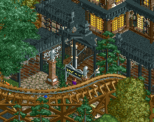
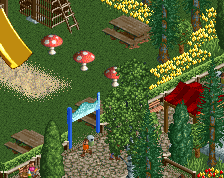
I don't find much of anything in this screen interesting. The foliage is nice, but it's thick and boring to look at. The coaster doesn't seem to have much interaction or visibility from the path. The station also isn't very exciting. I do like the purple canvas over the entrance, but the rest of the screen doesn't really have the Faas "fun-factor" that I've grown to expect.
Sorry if that sounded harsh at all.
The coaster uses its size well, and I like the queue.
inthemanual, this is for de concurenten 3, it's not supposed to be all complicated and it's purpouse is to avoid micro detailing and get back to original rct. why do you think he makes the write ups along with liampie?
I didn't say anything about details or how complicated it was, and I know it's for that contest. Faas doesn't worry about micro details anyways. I just don't think it's an exciting screen.
I agree that it isn't an exciting screen, but my god it's inviting.
Why are you dutch guys so good at this style?
you know what they say, the dutch masters
^Who says that?
I think the foliage could be a bit better. Perhaps one more tree type would look good.
it's kinda a joke, since the famous painters like rembrandt and others during the 17th century are called the dutch masters, let us have something too
We fucking invented it.
I actually made the foliage in the scenario editor using that button where you can just spread trees around.
Furthermore, I don't really care about stuff like that. It's just a blast from the past that I'm sharing with you guys.
Most of the screens from this project took me several minutes only.
Thanks for the replies though!