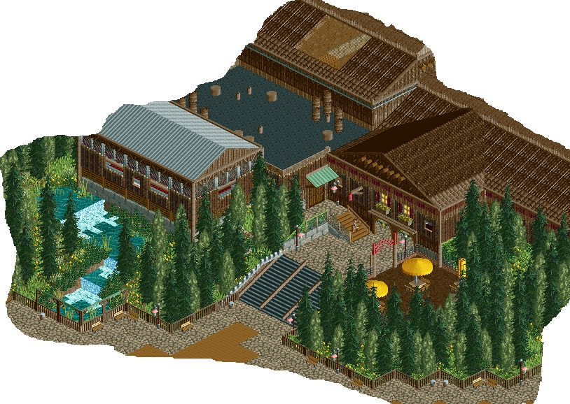
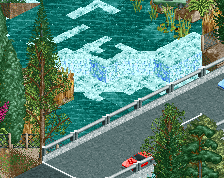
Screenshot / Hunter Valley Falls Entrance
-
 04-April 14
-
 Stoksy's Magnificent 'Musements
-

 12 of 21
- Views 1,831
- Fans 0
- Comments 7
-
 Description
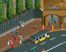
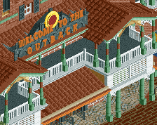
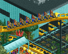
The park's log flume station; within which is a small cafe.
Reaching a point where working on the park is getting a little tedious and slow; don't have as much time to play which has resulted in low motivation. However, I want to get this finished just a warning that progress will be slow (have worked on some other areas in the park, but they're not screen worthy, yet). -
 Full-Size
-
 No fans of this screenshot
-
 Tags
Tags
I love the look of the trees
i second faas, try out some of the other pine trees, right now you've only got 2 different types of trees.
the rest look nice but you need more colour, even though it's a log flume and it's supposed all brown and scandinavian you should colour some of the other accents you have in brighter colour, like the flower baskets having another brighter colour and that little green roof could use another colour to stand out from the trees.
also i'd replace some of the ventilation pipes on the roof to other stuff, i'm not an expert on flat roofs though
The inexplicable change in roof textures for the last square is bothering me a bit, but maybe you have reason for that. I agree with gdb that you've got too much going on on the flat roof, and with faas that you need to consider more foliage types. Having only 1/4 tile trees makes it look really dense, which might be what you're going for, but You still need more variation in the species and colors.
Also, there's a big hole in the roof (looks like it's covered with netting) for seemingly no reason.
The main reason for a lot of the different roof textures is just to break it up a little; otherwise it'd just be all wood which is a little boring in my opinion. Originally I just wanted to use the thatch roof for the entire building but had issues because the object is made so that it doesn't connect properly.
I was going for density, and my intention was for the smaller foliage to break it up, but I can see the issue with the monotony. Generally I'm pretty good with sections of foliage (ie planters and small areas) but as soon as there's a large area like in this case I can never seem to get it right; I always think that every tile should have a tree/plant on it, and that isn't ideal for large areas.
Agree about the flat roof actually; I attempted to make it look less so but evidently got a little carried away looking back at it.
I like it. I just think the foliage needs a little bit of work. You have some really nice architecture and some lovely elevation changes, you just need to think about the placement of your foliage, which types of trees to use and what colours.
Looks very nice. Agree about the foliage.