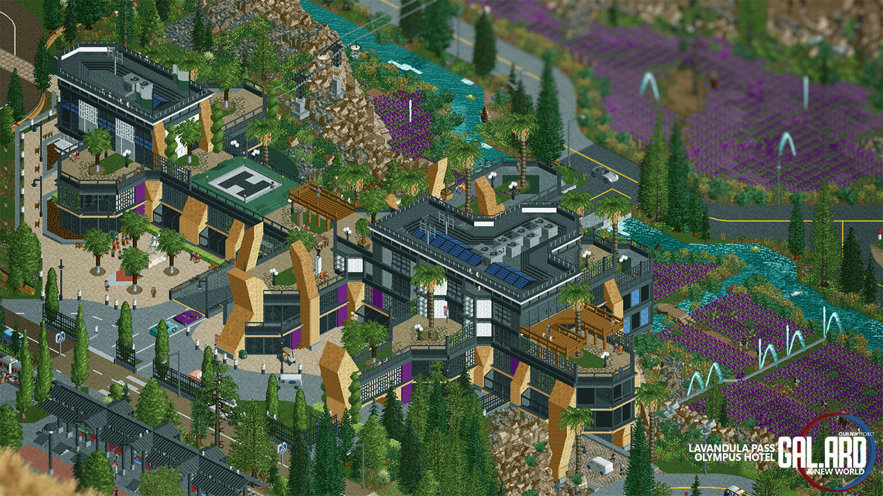
The Helipad is in a really odd spot being on a low roof, should really be on one of the two higher towers, also looks like it's a spot that a guest could walk around? Seems odd.
Otherwise this is fantastic! Love the architecture!
Really, the helipad position isn't as much a problem as long as it's clear of obstructions and obstacles - it's an okay spot - just might be limited in use in certain conditions.
Pretty crazy. It's usually quite interesting when people do modern architecture takes in 2018+ meta RCT2, and this is certainly convincing. It's nice how you create so many niches here and there for the eye to lose itself. It's enjoyable because what you find is pretty. I also really like the purple flowers. Well done.
Regarding the helipad - I think it's fine as it is, even though it's probably not as realistic. But this is planned to be a futuristic map (2050~), so there will be taxi drones all around the map and the landing pads will be located in a more "reachable/practical" spot - as in this case
Love the structure, modern archy after my own heart. Particularly love the different treatments you used to make sheer and semi-transparent surfaces throughout. My only criticism would be that I don't love light brown for the angular forms. I feel like those might look better in black or a darker color that blends them better with the rest of the building? Otherwise, really excited to see this project progress.
I love the sense of layering with this, as it blends in with its surroundings almost seamlessly. It feels very low to the ground and plays with one's sense of perspective, despite being a multi-story building over the edge of a cliff, if that makes sense. Just brilliant.
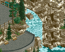
I'm definitely a fan of your work. I really like the second pic you posted in this thread. The rock work is so meticulous and "good busy." Fisch's rock set is my favorite personally and it was awesome to see it used so masterfully.
I love the sense of layering with this, as it blends in with its surroundings almost seamlessly. It feels very low to the ground and plays with one's sense of perspective, despite being a multi-story building over the edge of a cliff, if that makes sense. Just brilliant.
Thanks Jaguar - glad you noticed it. I planned it to be like an extention of the landscape
OddmentsAlchemyLab, on 17 Jun 2022 - 10:37 AM, said:
I'm definitely a fan of your work. I really like the second pic you posted in this thread. The rock work is so meticulous and "good busy." Fisch's rock set is my favorite personally and it was awesome to see it used so masterfully.
Thank you! Those rocks are really useful, even though i feel like there are some spots i need to rethink.
 06-June 22

![screen_7149_WestGate Dam @ Oasis [WIP]](https://www.nedesigns.com/uploads/screens/7149/7149_thumb.png)


The Helipad is in a really odd spot being on a low roof, should really be on one of the two higher towers, also looks like it's a spot that a guest could walk around? Seems odd.
Otherwise this is fantastic! Love the architecture!
The above comment on the helipad makes sense imo. Besides that... Wow! Very impressive! Daring architecture and pulled of nicely.
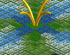
Oh, I really like this, the vast gardens are really interesting, generates a unique atmosphere.
Really, the helipad position isn't as much a problem as long as it's clear of obstructions and obstacles - it's an okay spot - just might be limited in use in certain conditions.
Really cool, looking forward to this.
Pretty crazy. It's usually quite interesting when people do modern architecture takes in 2018+ meta RCT2, and this is certainly convincing. It's nice how you create so many niches here and there for the eye to lose itself. It's enjoyable because what you find is pretty. I also really like the purple flowers. Well done.
Thanks guys !
Regarding the helipad - I think it's fine as it is, even though it's probably not as realistic. But this is planned to be a futuristic map (2050~), so there will be taxi drones all around the map and the landing pads will be located in a more "reachable/practical" spot - as in this case
Love the structure, modern archy after my own heart. Particularly love the different treatments you used to make sheer and semi-transparent surfaces throughout. My only criticism would be that I don't love light brown for the angular forms. I feel like those might look better in black or a darker color that blends them better with the rest of the building? Otherwise, really excited to see this project progress.
Where did you get the diagonal lights at the entrance plaza? I love those!
I think this screen may be your best work! I love the fields of lavender. Nice reference.
genius
AmusementParker, on 10 Jun 2022 - 4:41 PM, said:
I got those from splitvision!
I attached the other side for more context
Thanks everyone !
Very dramatic, quite cool. Personally would probably have been happier with classic jagged rocks. These are impressive, but look overdone to me.
I love the sense of layering with this, as it blends in with its surroundings almost seamlessly. It feels very low to the ground and plays with one's sense of perspective, despite being a multi-story building over the edge of a cliff, if that makes sense. Just brilliant.
OddmentsAlchemyLab Offline
I'm definitely a fan of your work. I really like the second pic you posted in this thread. The rock work is so meticulous and "good busy." Fisch's rock set is my favorite personally and it was awesome to see it used so masterfully.
Jaguar, on 17 Jun 2022 - 07:06 AM, said:
Thanks Jaguar - glad you noticed it. I planned it to be like an extention of the landscape
OddmentsAlchemyLab, on 17 Jun 2022 - 10:37 AM, said:
Thank you! Those rocks are really useful, even though i feel like there are some spots i need to rethink.I would like to see this in action, where's the download link?
^ He is still building this park I believe.