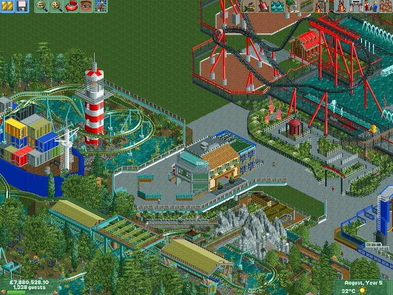
Looks really cool. Just don't forget to pimp up your paths a bit more. Now it looks like a big slab of concrete. Some small stalls, benches, lamps, etc.
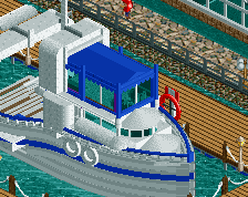
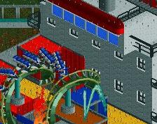
Not sure that a deep blue is the best colour for a boat in my opinion; would suggest grey but there's already a lot of that, so maybe the default red(?)
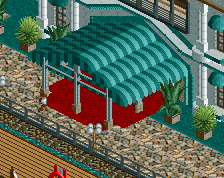
Agree with Faas and Louis; I think that there's just too much grey. I would either try replacing it with the crazy paving path (black path could work also) or have planters break it up; along with lamps, bins, and benches it would add a lot to the screen.
I agree with Stoksy, the deep blue is really overpowering.
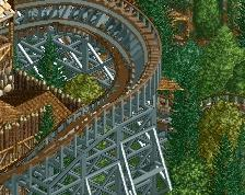
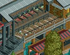
That queue line for the water coaster reminds me a lot of Chiller's old queue at Great Advernture which is cool but I don't love the tall fence obstructing people's view of the splash. This would probably be a major focal point so it should be easily visible from guest areas.
I'm nit picking a bit here. I actually really like this screen and think you have a very unique style.
Parkdat is arguably the most useful RCT2 tool out there (obviously 8cars but that's a given). It just gives you so much freedom and essentially bypasses the issue of a full small scenery list (which is really useful).
Parkdat is arguably the most useful RCT2 tool out there (obviously 8cars but that's a given). It just gives you so much freedom and essentially bypasses the issue of a full small scenery list (which is really useful).
holy shit. Im on it! as Ive said my first park with mods has been a massive learning curve
 03-April 14
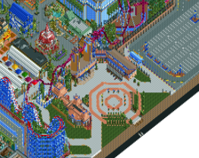
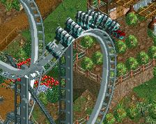
Looks really cool. Just don't forget to pimp up your paths a bit more. Now it looks like a big slab of concrete. Some small stalls, benches, lamps, etc.
I feel like your ride theming and supports and general ride areas are great, but then the in between stuff lacks and doesn't bring areas together.
Individually things are good, but together, they don't come across as well as they could.
Not sure that a deep blue is the best colour for a boat in my opinion; would suggest grey but there's already a lot of that, so maybe the default red(?)
Agree with Faas and Louis; I think that there's just too much grey. I would either try replacing it with the crazy paving path (black path could work also) or have planters break it up; along with lamps, bins, and benches it would add a lot to the screen.
I agree with Stoksy, the deep blue is really overpowering.
That queue line for the water coaster reminds me a lot of Chiller's old queue at Great Advernture which is cool but I don't love the tall fence obstructing people's view of the splash. This would probably be a major focal point so it should be easily visible from guest areas.
I'm nit picking a bit here. I actually really like this screen and think you have a very unique style.
Some of your ideas are great. Once your style is refined more, you're going to be really good.
ParkDat is your friend!
you sure can, you can also put things in afterwards and get stuff out.
arjan did a tutorial on this
http://www.nedesigns...rkdat-tutorial/
Parkdat is arguably the most useful RCT2 tool out there (obviously 8cars but that's a given). It just gives you so much freedom and essentially bypasses the issue of a full small scenery list (which is really useful).
holy
holy shit. Im on it! as Ive said my first park with mods has been a massive learning curve