Screenshot / Hersheypark - Founder's Way
-
 27-May 22
- Views 4,153
- Fans 4
- Comments 28
-
 Description
It's time to officially introduce my newest project, a full recreation of Hersheypark! Over the past two years, the real park has developed into something very special for me, in that 1) it is where I rekindled my passion for amusement parks and roller coasters, and 2) it is where my wife and I are now instilling that love of parks in our children. My apologies to navalin and JJ, who I know have worked on recreations of their own. I fought with myself for a long time about whether I should actually do this park out of respect for their work, but I ultimately concluded the park is too important to me now not to do it.
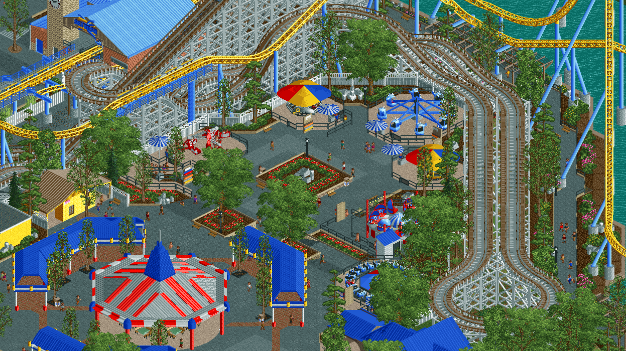
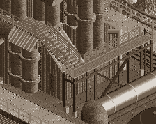
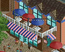
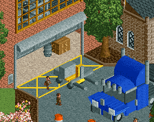
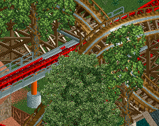
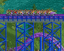
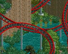
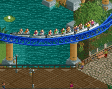
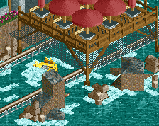
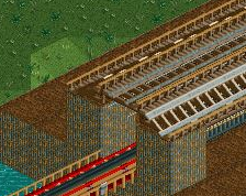
Pictured is part of the Founder's Way area of the park. Prior to the opening of the new entrance area, Chocolatetown, this area was immediately after the entrance gates. The Carrousel used to be located under the red, white, and blue cover, but was relocated to Chocolatetown as part of the new entrance. Now, it is used for seating during regular season, and as a stage for HP in the Dark and a spot for pictures with Santa during Christmas Candylane. Surrounding the former Carrousel cover are numerous kiddie and family rides. -
 Full-Size
-
4 fans
 Fans of this screenshot
-
 Tags
Tags
Edit: from the overviews I can see, some of the darker blue roofs look more purplish, maybe try that.
Yeah, this was discussed in the Discord #wip-feedback channel a while ago, and I'll probably try to make the darker blue a little less saturated through palette adjustments. Just haven't gotten around to it yet.
Sweet stuff. Love that it ends in a waterfront. It's lively and pleasant to look at. The line-up of small rides in an arc shape like that makes good sense, and for a nice interaction with the coaster.
My only gripe with your style sometimes is that it's too technical. I miss some organic and rough(er) parts that don't look manicured. I know that's not very you though.
Really admirable mission with this park Saxman. I think your passion for Hersheypark and amusement parks in general shows in this screenshot.
Mentioning Navalin and JJ is nice too. I think acknowledging other work but then giving your own take on the same idea is great.
Other than that, this looks great!
This is absolutely fantastic. Very reminiscent of HP and Carrousel Circle/Founder's Way. I would bump out the ride perimeter fencing for the scrambler by a quarter tile so it's not rotating up against the fence. Also not digging the turnaround on Comet. There's probably a better way to do it. Great work otherwise.
This feels so fresh yet so classic, its quite inspiring too. The blue pops! its so good, its a ton of fun. im really enjoying this project!
Little Joe 2016 Offline
When do you think the park will be complete? I can't wait to download it!
Same! This is looking really lovely. I like the primary colours. Generic American realism, but with an aesthetic to it.
Thank you all for the kind words! I'm having a blast working on this so far, and it's great to be working on a full scale park without having to worry about the object limit. A lot of the quarter tile stuff in this screen (queues, landscaping borders, etc) wouldn't be possible without NSF.
It's a long way off yet. I'd say this area is basically done (could use some polishing), and the entrance area is like 50% or so? Everything else is ride layouts and planning. But I'll keep posting screens as I make progress.
Love it man!
Always room for another. Nobody stops playing Mozart just because it's been recorded already!
I dunno how accurate this is, but I love it and I'm very glad to see you build anytime!
Very nice and clean. Good use of colors and nice placement of the rides. Very refined.
Is that... sloped mulch? Do we get mulch landblocks along with this beautiful recreation? I love everything about this screen, but a new object that I will use in literally every CS build after this release is a fantastic bonus.
It's actually a custom land texture that will be released soon!
I love this screen and I can't put my finger on why. It's very generic realism with primary colours, but it's just so clean, lively and likable.
Thanks Fred!
Thanks Jappy! It's nice to see that people still like to see me building.
Thanks AVL!
The sloped pieces themselves are already on my custom scenery thread (https://www.nedesign...jects/?p=778262), but I'll be releasing a custom terrain surface shortly as Gustav stated. It's finished at this point, just doing some real playtesting (using it in my project) to see if any bugs pop up.
Thanks Alex! I'm not entirely sure what I like about it either. The atmosphere of this part of the real park is great...lots of kids laughing on all the kiddie rides, plus Skyrush and Comet flying past every so often. I was aiming to capture that feel, perhaps I was successful.
Little Joe 2016 Offline
How's Hershey Park coming along? Any updates?