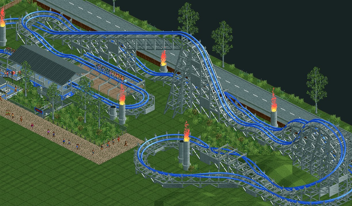
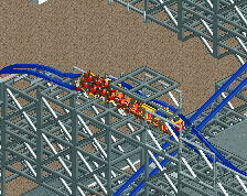
Screenshot / Low Rider
-
 27-May 22
- Views 1,431
- Fans 0
- Comments 3
-
 Description
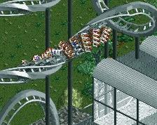
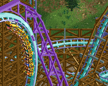
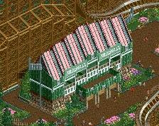
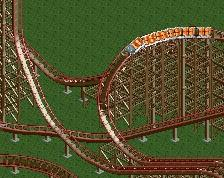
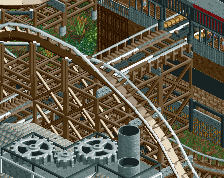
I'm starting my transition in to a more modern style. I know it's rough, but I will improve over time. I haven't quite finished, especially when it comes to the pathway, but the coaster itself is pretty much done.
Excitement: 8.73
Intensity: 6.32
Nausea: 3.48 -
 Full-Size
-
 No fans of this screenshot
-
 Tags
Tags
Keep working on it tho, like I said the layout is pretty solid.
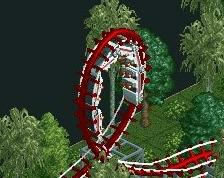
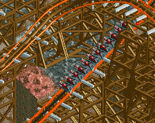
I like what you've done with the lift hill supports. That first inversion looks pretty low to the ground, though. I'd imagine those forces would be a bit intense!