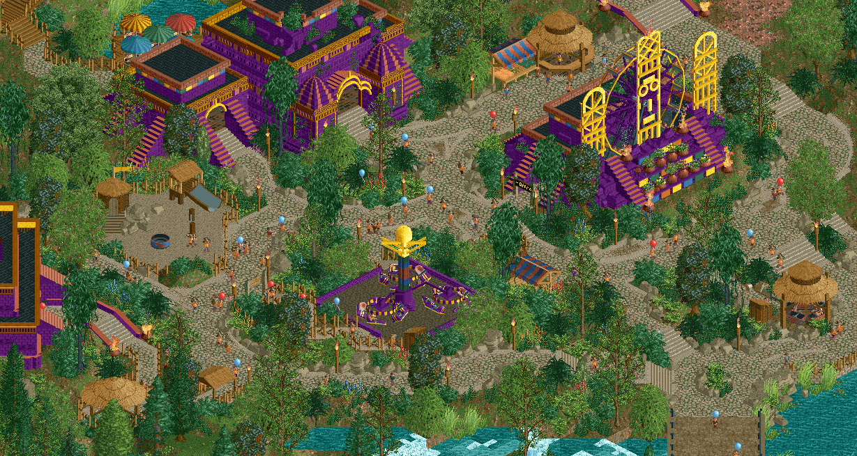
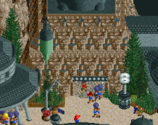
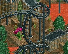
What the fuck Jene, this is nuts! I think the area can improve from a more clear hierarchy in the paths, it's missing a central 'hub' or at least a section of path that's not just a traffic space, but also a place to stand, sit, and look around. The planter between the temple and the flat ride would be good for that I think.
This made me make a funny "j'OUFF" noise on first glance and not many screenshots have done that. The color motifs and sculpture work and crunchy goodness on the path are just sooooo goooooooood. I am gonna pull a Walto here and say some path-level details would really spice this up such as benches and garbage cans. Dynamite screen, you are sick as hell.
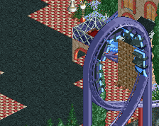
The purple is a very daring colour to use but you did it very well and succesfully set it up against this beautiful beige and green background. Wonderful work!
I do wonder if you could use more purple accents to "connect" the buildings with each other. As it stands it looks somewhat odd that the buildings are this very strong color that never appears anymore.
Glad to see this continued from the H2H snippets you had. Lovely colours, very bold choice for the purple but it sticks. Lovely foliage work and path detail, but I agree it could use a center of some kind to ground it.
 09-May 22
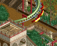
What the fuck Jene, this is nuts! I think the area can improve from a more clear hierarchy in the paths, it's missing a central 'hub' or at least a section of path that's not just a traffic space, but also a place to stand, sit, and look around. The planter between the temple and the flat ride would be good for that I think.
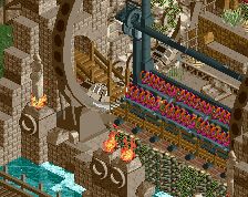
I love your work and this is no exception. Great colours, great theming. Steve should take beige notes.
This made me make a funny "j'OUFF" noise on first glance and not many screenshots have done that. The color motifs and sculpture work and crunchy goodness on the path are just sooooo goooooooood. I am gonna pull a Walto here and say some path-level details would really spice this up such as benches and garbage cans. Dynamite screen, you are sick as hell.
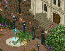
Great work, so many interesting things going on.
Despite the path-islandy composition it comes together well. Color pops work great
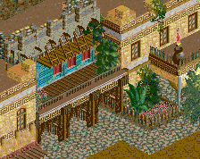
Wowwww this is hot
Damn, this is spicy. Bold colors!
The purple is a very daring colour to use but you did it very well and succesfully set it up against this beautiful beige and green background. Wonderful work!
I do wonder if you could use more purple accents to "connect" the buildings with each other. As it stands it looks somewhat odd that the buildings are this very strong color that never appears anymore.
Glad to see this continued from the H2H snippets you had. Lovely colours, very bold choice for the purple but it sticks. Lovely foliage work and path detail, but I agree it could use a center of some kind to ground it.
Really love this. Awesome work, Jene!
This is dope
Spectacular. Love the bold color but also the immediate sense of immersion from the path layout.
Thank you all for the kind words. I'll definitely try to create a nice hub in the centre and I'll be sure to add some more path details.