Screenshot / Trifouilly-les-Oies
-
 19-April 22
- Views 2,313
- Fans 3
- Comments 19
-
 Description
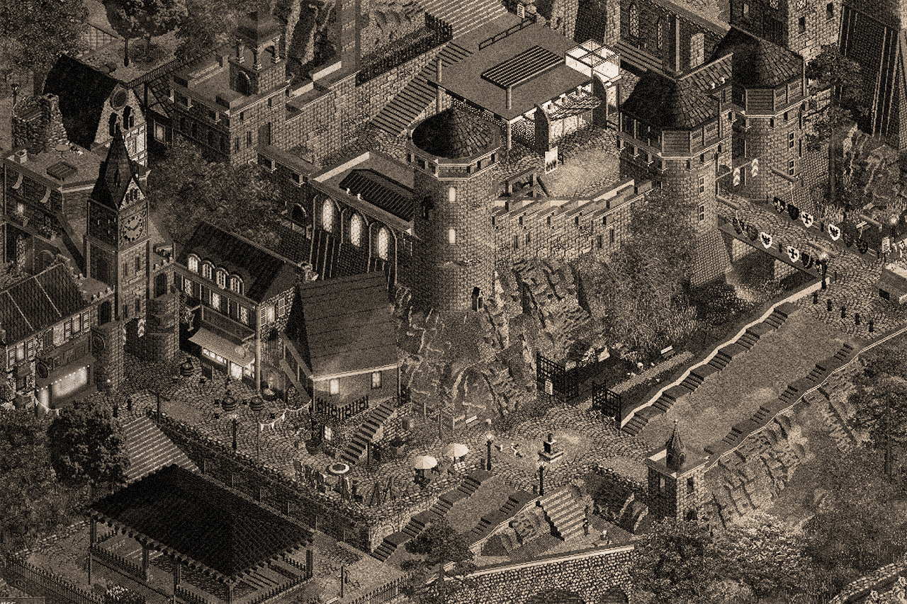
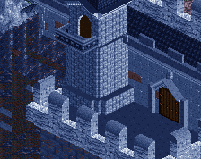
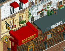
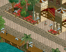
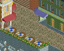
For the last 3 weeks, I have been working on a small medieval park after getting bored with my "Paris" map. I think I'll upload it this week (the park is 99% finished). I'm sharing this picture with you as a little "teaser"! (No misunderstanding, the photo has been coloured with photoshop, I like to work and experiment on my photos)
-
 Full-Size
-
3 fans
 Fans of this screenshot
-
 Tags
Tags



Awesome work. I dunno if you need the steps on that ramp, or the crown moulding - go for something more natural looking/less pristine
Wooooooooooooooooooow.
Damn, looking very nice
Wow dude, this is phenomenal stuff! Totally different from your other parks I've seen, but unique stylistic, I love it! Keep the good stuff coming
What?? This looks unreal, like Age of Empires 2 or something. Really impressive, and so stoked to see more Babar work!
Absolutly in love with this!
is it Rct game it looked like a black and white filter from Age of Empires II nice work man go on this is epic
Thank you for these feedbacks!
I'm not an AoE player however I'm a huge player of Crusader Kings II !
An excellent scene you've set here. The rockwork is somewhat clunky in relation to the precision of the architecture--it seems as if you're using almost exclusively jagged sloped pieces to fill in space rather than to create shapes, which is a stark contrast to the almost photorealistic nature of the architecture and surroundings. Look at the cliffs in Villerouge, Madinat and Gladsheim for examples on how to combine jagged pieces with smooth slopes and vertical edges to create more natural shapes. If your rockwork becomes as strong as your sense of architecture and composition, you'll be unstoppable!
Knowing you did this map in three weeks is really motivating me to take on a smaller project as well... I always postpone my ideas and only take on large multi year projects. This looks so fun!
Liampie, on 22 Apr 2022 - 10:52 AM, said:
I encourage you on this path! Personally I realized that I had a lot more fun on small parks/maps, I'm more creative and precise on small environments!
"Trifouilly-les-Oies" lol my dad used to say that all the time
Impressive as always though!
WoAHAhaH this is super gorge! So mooooody and vibe!! The archy is so gorge. love love love
Wtf sib? This isn't even RCT anymore. Great work homie.
Hypnotized... Damn... This is awesome. Definitely my taste. Not sure how you pulled of that offset building, but it looks cool.
Aesthetically I love the screen. I won't lie that I feel the filter masks some of the imperfections, but the overall composition is excellent and with every screen you seem to be improving drastically. With a few projects under your belt, you'll be a force.