Screenshot / The Island's Harbor
-
 06-April 22
-
 Carribean Island
-

 3 of 3
- Views 1,973
- Fans 0
- Comments 9
-
 Description
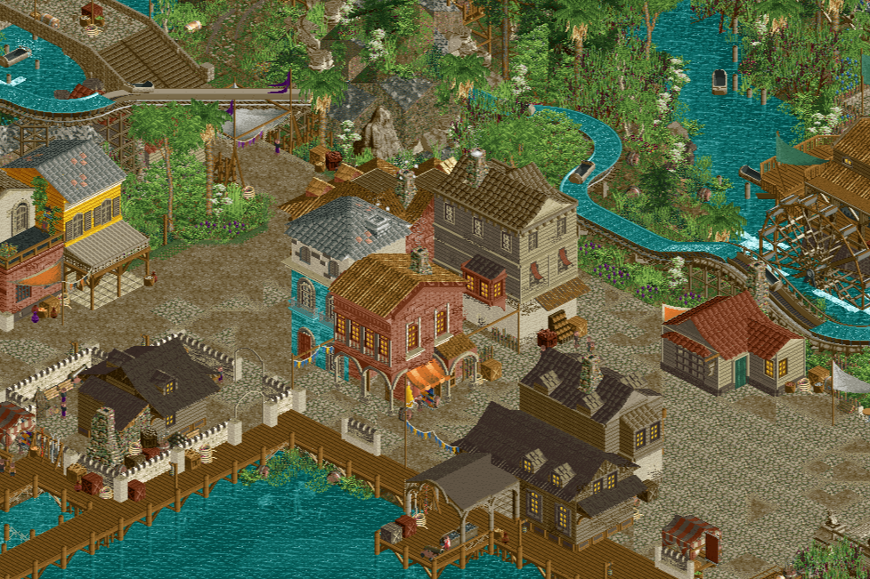
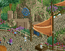
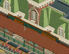
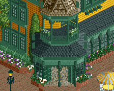
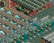
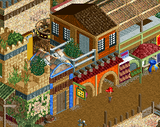
The burgeoning harbor has seen a lot of construction lately, including a few new warehouses along the water's edge, and a new blacksmith. There's street merchants selling their wares in this new Caribbean port. Will the island prosper, or will the influx of pirates who have begun to camp out in the gully just beyond the flume cause chaos?
-
 Full-Size
-
 No fans of this screenshot
-
 Tags
Tags
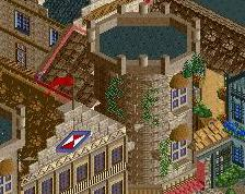
Great screen! Love the houses and the atmosphere.
A few points though:
- The combo LOTR rock and standard landscaping in the back is not the best. I'd say go for one or the other. Or try to blend them more.
- Be careful with that shade of brown on your buildings. It looks great but can blend too much with the path you've chosen here.
I am very interested in this project though since you first have shown a screen of this. Looking forward to see where this goes.
Really liking the detail on the architecture here, big improvement for you over your older cso stuff. Kinda wish the overall archy density was higher though to make it feel a bit more lively and adventureish. Sort of imagining the two in the original PotC movie and how dese that was. Paths can probably do with a little more vignette/scenes and stuff like that too. Just to make it feel more lively.
Overall on the right track just maybe needs another push to really make it special.
Adding onto what G Force said, there are two big openings where there's really not a lot going on. Open spaces can be good in the right circumstances, but filling them out with either additional buildings or gardens or fountains or something would really make this scene feel complete
Probably won’t add fountains/gardens. Pirates I assume aren’t too worried about beautifying the town yet
I guess the context is what makes it then, and it may be hard to tell from just that crop. I still feel like those spaces I mentioned are a bit empty though. Even a few market stalls or something to add some focus and contrast.
It's nice but perhaps a bit featureless? Think it might help to have more things the peeps can do other than (just) buildings.
Great foundation here Otter, now just bring it to life. Kick up the atmosphere to level MAX. You said pirates aren't into beautifying their town, but is this a pirate village or a theme park? You want guests to have fun in here, not say themselves: "What is that fountain doing in a pirate village?!?!?!"
my biggest issue with this screenshot is how you've made certain design decisions to make the space feel worn and organic, and yet the heavy angularity and sharp lines that your buildings and general layout of the area create clash with that idea.
the landscaping leaves a lot to be desired and could benefit from either going the fisch-rock path, or being purely clean and using just raised land / 1/4th tile land pieces.
it does feel "featureless' but at the same time i have a hunch that that's caused by the screenshot and likely the area itself does not suffer from this.
My main gripe is that the building typology is very diverse while all buildings are somewhat standing freely as monoliths within their space. If it’s a port with that much space, I expect the buildings to have the same typology across the port and be more flat and wide. The tall buildings that are likely residential houses atm are your strongest pieces of architecture in this screen. Such narrow yet tall houses in historical ports mostly existed because the building densities were so high that large warehouses could only be created through building upwards. There was no space on the ground, so they all received tiny footprints with many floors stacked on top of each other. Even normal residential houses in auch port towns usually had multiple dedicated warehouse floors.
As the screen rather shows “buildings between paths” instead of “paths between buildings”, the tall and narrow houses, which are the strongest pieces of architecture, don’t feel like believable additions to their surroundings. Check out historical port cities like Genova, Venice, Amsterdam, Lübeck, Antwerp, etc. and look at how their ports are laid out and how dense they are and get some inspiration from those. You’ve got the technical rct skill set. Now improve the storytelling of the composition.