Screenshot / Riverview Pavilion
-
 23-March 22
- Views 1,976
- Fans 2
- Comments 16
-
 Description
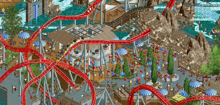
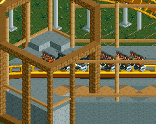
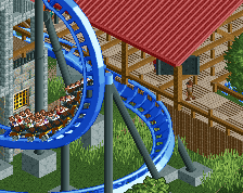
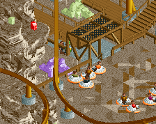
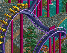
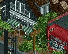
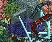
Cool off, have a bite to eat, and watch FireBlast soar overhead at the Riverview Pavilion! Nestled beside the Rambunctious River and Helix Mountain, The Riverview Pavilion serves up a variety of traditional, delicious fare. Careful, don't sit too close to the rapids or you might get wet!
-
 Full-Size
-
2 fans
 Fans of this screenshot
-
 Tags
Tags
Jesus dude, you're just plowing away at this huh
It's a little chaotic and messy, but thats not necessarily a bad thing. It's really enjoyable to view - if a bit tough to decipher in spots.
Glad to see you building!
I really appreciate the feedback man!
I'm noticing now that the peeps being static makes it look quite messy. With the peeps moving around in game it's easier to see what's going on. (There's a fk ton of peeps in this area, they love it.) But otherwise I hope the other angles will take care of any hard to decipher areas.
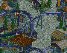
Here's the same screen with no peeps:
Attached Thumbnails
I would eliminate the black flanges on the supports tho and instead make them just gray.
I'd also try to clean up the diagonal supports on the wooden coaster track drop at the top. There's plenty of good solutions for diagonal objects today that would clean this up a lot.
Super fun tho!
This is such a cool project! Love seeing the development over the last few weeks!!! looks like such a fun coaster
I actually like this a lot. Agreed with G on the flanges, but I love how busy and fun this is. Has an air of festivity with the coaster sprawling over all those guests walking around. Love that feel.
Love
I really like this screen! Looks super wild and fun all around.
The only part that looks too messy to me is the rockwork. right now you have the tolsimir rocks, LOTR, and the canyon rocks. It might look a bit cleaner if you cut it down to one or maybe two rock types instead of three.
Thanks all for the lovely comments!
Just to give a little context for those who missed my discord posts: this is first thing I've built in 8 years, so it's a bit of a comeback/warmup project. Interestingly it's also currently the most finished thing I've ever built
Throughout the build I've been constantly discovering and learning all the new features and objects; testing out styles I've seen others make, just full experimentation with what Open has to offer. And trying to surround it in a very fun, classic RCT environment.
I'm already 40% through the obj limit which surprised me. I had anticipated potentially being able to expand this park with 2 other areas but that's unlikely at this point. Just going to finish out Helix Mountain as strongly as possible with some supporting areas.
Flanges colored grey and ugly rapids supports gone. Will take a look and see if I can avoid putting too many of the rock types in one area. For future projects I want to explore the other rock object options that have been made recently but for this project I'll just stick with what's done.
Thanks again everyone.
Wait, are you playing on the newest version of OpenRCT?
There's basically no object limit anymore with the newest version which includes a different save format that opens up lots of new features.
Wow this looks fantastic!
Might be the dissenting opinion here, but that restaurant would be way too loud to eat at! Too dense for me. Love the tunnel though at the top of the screen that the coaster goes through.
I can't use the latest version, my macbook is running an outdated OS and the latest version of Open requires 10.14. Getting a new computer soon though.
I was aware of this when I began this project. I figured the object limit on the old save format was a good test/goal for myself to start.
There's nice quiet areas to eat off to the left and the right! You don't haaaave to sit directly under the coaster
A bit messy in my opinion. I think either the flags or the trees gone could improve it. Otherwise sick stuff as always.
Nice use of textures. Also quite fascinating from a peeps perspective. Looks chaotic from the overview, but nonetheless fascinating.
Thanks guys. The park is definitely designed from peep perspective, and is somewhat small in scale, and a bit cluttered, as a result. (I'll be building bigger on future projects).
This area is intended to be a bit chaotic as it's the central plaza of the map, but I've cleaned it up a bit now. Cave entrance much better and reduced the clutter in the plaza. Hope you will like the final result!
It's chaotic but a whole lot of fun. I think you could clean it up at the path level by cutting back some of the double TVs, benches and lamps and only having one show (tile inspector does that I think?).