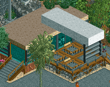
As otter said - not too keen on the rail colors, but its minor. I also think this would benefit from a bit more open space. Clean up that foliage a bit. Keep some in larger clumps and leave room for some open grass and gardens.
Yes, lots of yellow, but I think it works. Consistent colour schemes always work and more people should do it. This is just very nice stuff, feels quite old school too.
 15-March 22
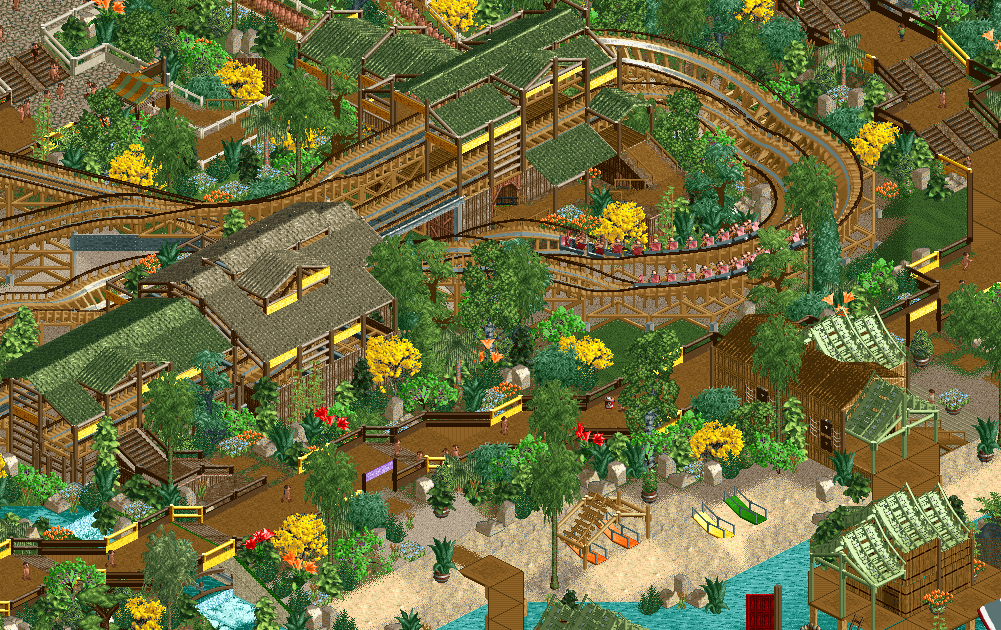
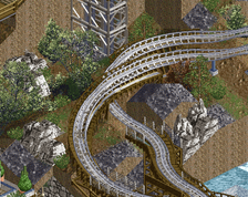
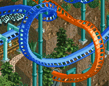
Really cool looking station. Not a huge fan of the coaster rail colors. Bold, but it stands out a lot. Lively colors everywhere else!
This is great. Love the colors and overall vibe.
As otter said - not too keen on the rail colors, but its minor. I also think this would benefit from a bit more open space. Clean up that foliage a bit. Keep some in larger clumps and leave room for some open grass and gardens.
Always love seeing work from you!
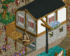
too much yellow and brown for me.
Does feel like there is a lot of yellow in the screen tho, almost like you need another accent color in there.
i agree with the other comments about the colors being too much. Especially the dark brown on the coaster rails bothers me. Otherwise solid stuff!
I quite like the colours. I think they're fun.
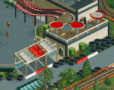
This park was fun to look around in- Super cute screen, very vibrant!
Yes, lots of yellow, but I think it works. Consistent colour schemes always work and more people should do it. This is just very nice stuff, feels quite old school too.