Screenshot / Jaguar
-
 15-March 22
- Views 1,502
- Fans 0
- Comments 9
-
 Description
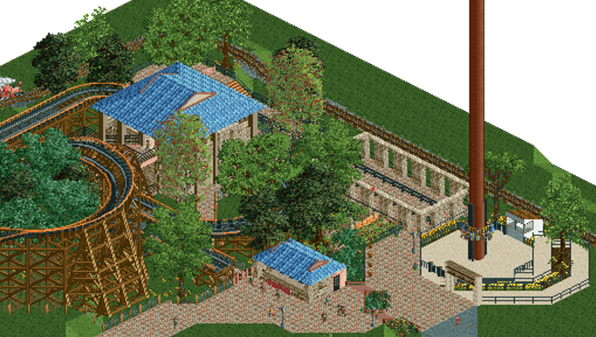
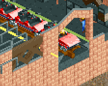
Jaguar is a roller coaster that sends its passengers on an exciting expedition through the jungle. The area is themed after an archeological dig in a Mayan temple, and the attraction itself offers its riders the feeling of a cat stalking its prey.
-
 Full-Size
-
 No fans of this screenshot
-
 Tags
Tags
I am honored
https://ibb.co/nPgDWT3
Better quality screen.
I remember this. You really improved it with all the feedback on discord. Keep going!
It's a decent enough start just keep going with it! I do think you could do more to sell the theme tho, I'm not really getting Mayan temple from this. Do you have a reference image of what you're trying to create?
Definitely an improvement over your previous work, but I think you should finish the area more before posting for more feedback (and should result in better ratings). Filling it out with more content and finesse will give us a better idea of what you're after, and will help you get a clearer picture as well.
This could be as simple as more foliage to fill the grass/negative space (unless the openness is intended), or as far as more archy, path details and/or theming.