Screenshot / Beachfront
-
 02-March 22
-
 Haunted Harbour
-

 5 of 6
- Views 1,887
- Fans 1
- Comments 18
-
 Description
Featuring rides from several decades, the Haunted Harbour waterfront makes up the bustling entrance to the rest of the park. Serving riders of all ages for nearly 100 years, the classic rides remain well maintained and ready to entertain for years to come.
-
 Full-Size
-
1 fan
 Fans of this screenshot
-
 Tags
Tags
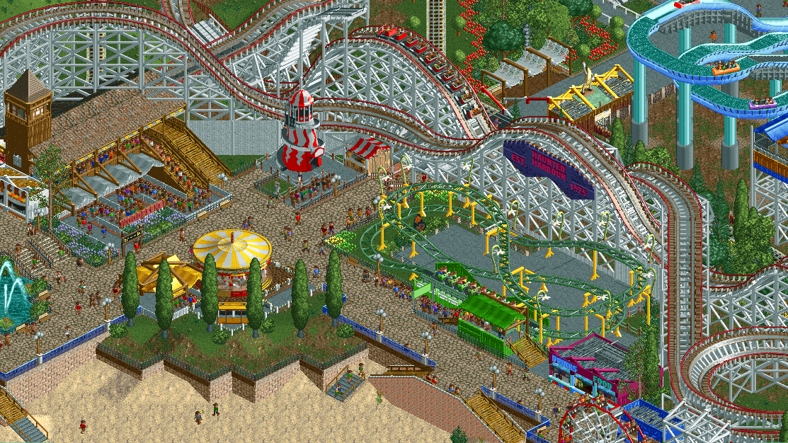
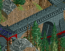
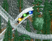
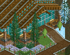
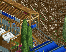
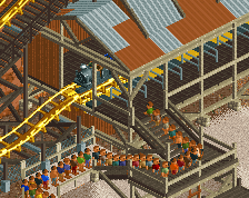
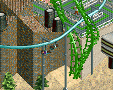
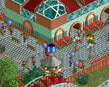
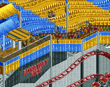
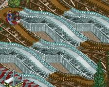
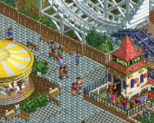
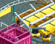
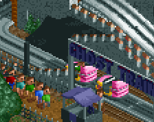
Lots still in progress here; I know! Just really enjoying this and wanting to share. If you have suggestions, keep in mind that anything here is subject to change in the future in the first place. (I.e. Ignore some visual bugs, they've been squashed)
The theming on the kiddie coaster is just mint. So so so good
Personally I'd continue the same brick texture on the whole beachfront and not include the pink stone.
Love this project overall. Very fun.
Subtle genius, minimal work, bringing it back to basics. Great screen indeed!
The brick wall isn't capable of slants, so I'm assuming the shape of the wall must have mattered more than the texture in this instance. The Egyptian fence would match the other color a little more but the bricks would be a lot larger to the point of looking awkward. Another possibility is using Roman walls and fences the whole way through if red trims on the top isn't a sin.
Pretty much this; egyptian isn't ideal, some of the other brick options were further removed from the wall brick. Pink stone isn't 100% ideal, but I think it works the best. It's an addition to the seawall, so having it a different material isn't out of the question. That said, I may include some signage/sand dunes to break it up a bit more.
I was going to mention glass walls also work on slopes so you could theoretically get their colors to match by layering those on top, but your explanation also works.
There is some piece of random queue at the bottom of the kiddie coasters's lift.
I love it! Simple, yet really vibrant. Can't wait to see more!
Loving the look of this. This is the vibes I wanted with Clovelly all those years ago.
Lovely stuff. Something that bothers me though.. the spiral slide corner feels unfinished. Maybe its the bare grass. Not quite sure. Just needs one more pass of detailing.
Am aware, already fixed.
Yep, figured I could probably mention it too. Planning on some decorative foliage/etc there
As you know, I'm a big fan of scenario recreations, and this def seems to be loyal to the original but with your own twist, as it should be! Loving the vibe here and the use of those flower lamps on the caterpillar is genius.
I am a bit worried though that the terrain has been flattened quite a lot in comparison with the original? I am interested in seeing more though, this could just be a perspective thing.
The terrain will be changed from mountain tool spam to more realistic headlands a bit further inland.
Nice lively screen. I'm finding the steps down to the beach a bit incoherent - not just because of the pink stone wall but also the use of wooden steps and tarmac. I would suggest going for a more solid stone look with either crazy paving or rapids lift - or alternatively go with wooden steps and structure.
Wood steps/structure might be what I’m looking for, actually. That sounds nice…
Incoherent is my worry for this park in general. All the individual bits look nice but as a good amount of dissonance. My usual fence anarchy argument applies here, but it's also stuff like using a different brick texture for the ramp than for the main retaining wall, the railway crossing gates aligning with the fries stall made out of the same object, and lack of recurring elements in general. The grass around the slide and the greenery (brownery) around the merry go round tell me you didn't really know what do with those tiles (my suggestion: paths all the way). If you cropped out the beach, I would never have guessed that this was a boardwalk-type park.
Some things I like: Woodpecker's station with the tower and the double ramp (path texture fits well here), spiral slide mats booth (great detail! Somehow never seen it before, but could be me), and wacky worm supports. I think the wacky worm would be even better if you continued the double supports under the lift even if there's no track underneath, in my mind that's just the way such a coaster is supported. Also consider painting the supports the same shade of green as the flowers! I think that'd be really neat. And in that case I'd give the track a brighter colour in return.
I can understand concerns about incoherence and dissonance - I think one of the big issues is that the park is nowhere near complete. On the other hand, I think that a certain amount of “everything crammed everywhere” will also suit the final product. I’m keeping it all in mind, but I think there’s a lot of detail and finish I want to inject before seriously considering any changes to the way the park is set up/presented.