Screenshot / VK: The Little Kingdom
-
 30-March 14
-
 The Vermillion Resort
-

 11 of 36
- Views 2,082
- Fans 1
- Comments 7
-
 Description
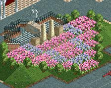
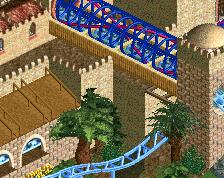
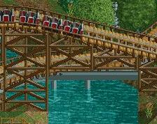
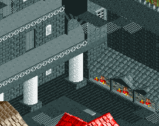
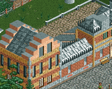
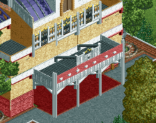
The many stories of Vermillion Kingdoms all begin here. The entry is Miami viewed through the eyes of an awestruck young Hernando, an idealized vision of how he remembers it when Little Havana was his Little Kingdom. The larger-than-life spectacles of Spectrum Theatre and Madame Elle's Magic Shop warm guests up to the storybook lands ahead.
-
 Full-Size
-
1 fan
 Fans of this screenshot
-
 Tags
Tags
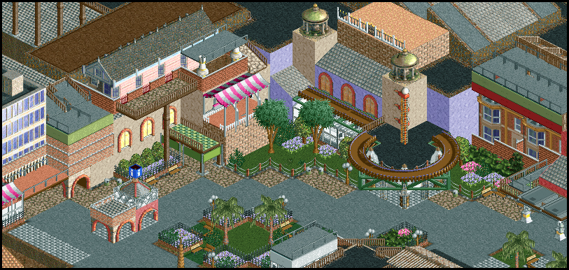
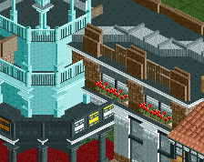
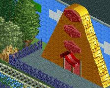
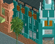
I feel like it just needs a little bit of refinement...It's not very cohesive, and some of it is a little messy. You do, however have some great ideas in there like that information boot and the use of the apartments/townhouses, and I like your use of the cabbage trees. I never really liked the look of them, but I like them in this screen!
Very clever use of the pre-built houses to make a façade.
Hypertwist Offline
I really enjoy the rounded awning and the area immediately surrounding it. It feels the most cohesive.
Very nice. I see development in your style.
I'll say there are certainly a lot of ideas here, which can be a little busy at time, but i'm still loving all of this. Makes me want to work on that LL design i abandoned....
so lovely