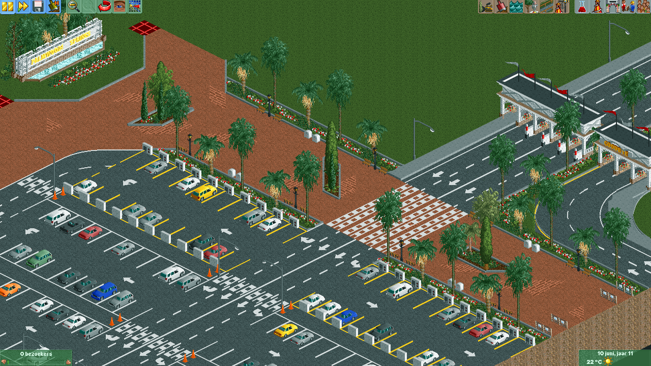
Screenshot / Palmwoods Springs main path
-
 06-February 22
- Views 1,871
- Fans 0
- Comments 12
-
 Description
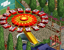
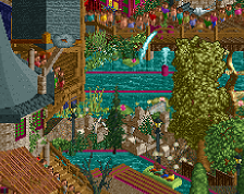
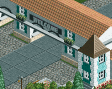
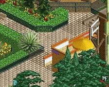
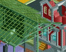
Back with my second screenshot of my new park Palmwood Springs! Worked on the ticketbooth, parkinglot and main road to the main entrance of the park. The main entrance still need to be build but it will have the brown and white colors.
Hope you like it!
PS: I would love to have some tips about the walking roads for the people because they already seems to get stuck before even get to the main sign xd.. -
 Full-Size
-
 No fans of this screenshot
-
 Tags
Tags
Demo Offline
Hey i'm no expert but to avoid guest getting stuck you have to consider they can read a map but only remember 4 or 5 direction, after that it's too complicated and they do not look at their map again.
So if to leave the park, or go to the toilets or to a particular ride guests need to go through path with more than 4 or 5 junctions, they can get lost which happens less often when guest are happy, can wander randomly in rides they like and are often proposed food drinks and toilets.
You can use parralel path separated with invisible fence to reduce the number of junction
The worst you can get is a U- shaped obstable and guest being stuck inside trying to path around. If the way around require them to plan a trip with more than 4 or 5 junction they will be unable to do so and complain they are stuck, if this prevent them to reach the exit or a ride, then they will stockpile in the guest trap forever, this you can see using the map mode to localize guest by their thought. sometimes it's only noticeable after some times that you accidently removed a piece of road underground
also i laughed at the use of the air conditionning unit to make the reserved place, inspiring one !
This has so much potential to be amazing. However I feel like the crosswalk object could be substituted for the 1K half flat roof texture for something more conventional. I also feel like you should either swap out the red brick where the crosswalks are for road or just ditch the crosswalks there altogether.
Darniss Offline
Thanks for your explanation! I've changed the whole main path now with invisible path 1 tile wide so that the guests can go only one direction with now and then a junction so they can go across.
The red floor in the left corner is just for me to remember where the invisible path is otherwise i have no idea where i put it all xd
Thanks for mentioning underground path, I hadn't thought of that yet.
The air conditioning units was suppose to be something to charge your EV's with haha but reserved places are also a good idea to have!
Darniss Offline
Thankyou man, appreciate it!
I've worked with the 'standard' GW road line pack but indeed they can be placed a little more subtle, going to change that!
Good idea to swap the salmon path over the crosswalks into the black tarmac!
Darniss Offline
Thanks!
Good idea to swap the salmon path over the crosswalks into the black tarmac, makes it a bit more logical to!
Demo Offline
oh but that's better than reserved place !
I'm bad at recognizing things but i don't realize it often because i think they are something else
I need those little details like a cable or a sign to understand other people thing, it gave me idea to improve my builds with such incorporation now haha
Darniss Offline
Yeh haha me too, maybe I can change it a little bit with indeed a cable or something with a sign to make it look more realistic and logical for the people and the viewers of the park.
Great start!
Here's a couple of ideas for you if thats cool.
Parking lots are funny in this game - some people hate them, some people love the context they provide. I think they're a good addition to the map in order to give a proper sense of scale and surrounding, so I appreciate that you're taking the time to flesh this one out. Please excuse my rushed photoshopping haha
1 - I'd add some yellow barricade poles for the borders of the guest walkways and roads. Maybe not as many as I sketched in the notes, but definitely some. I personally like to include them because they add another layer of detail but also provide a nice pop of color and repetition.
2 - Swap the first row with handicapped parking. Make sure there's some space in between for unloading. If you really want to be realistic, I'd even consider pushing the foliage/planter back a tile and leaving room for them to unload and have a direct access to the path without having to go back into the road. OR you could make little single tile pathways through the planter where I mocked up the diagonal white lines, which would break up the foliage a bit and provide access.
3 - If you want to do electric vehicle charging, consider making it green! A quick google search of electric vehicle charging stations in parking lots shows this pretty well. Again, would be an excuse for a nice pop of color and added realism.
4 - Fill in the gap in pavement where the cones are with some striped lines
5 - Add a few more tall lights on the guest paths
6 - put this badboy in there
Again, take this all with a grain of salt! It's not perfect advice, but it would definitely help a little bit I think.
Great work. You've got such a promising start. Looking forward to seeing more!
Josh
Darniss Offline
Thankyou man for your ideas! Some of them didn't even cross my mind so that was an eye-opener.
Going to implement some of them in the park! Obviously number 6 xd hahaha
Trying this week to build up the space around the parking lot, the fences and the main entrance!
Great to hear!
Hey, if you're interested in a quicker form of feedback, feel free to join the NE Discord server. There's a WIP channel that would be perfect for this project as it develops.
The link to the discord is at the bottom of this page.
Darniss Offline