Screenshot / Fantassima First Screenshot
-
 27-March 14
-
 Unfinished Projects and other Screens
-

 2 of 20
- Views 1,555
- Fans 0
- Comments 5
-
 Description
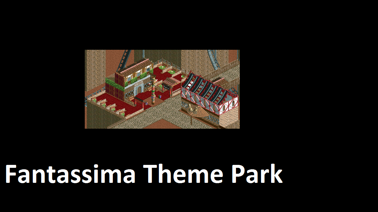
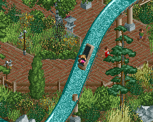
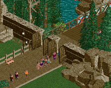
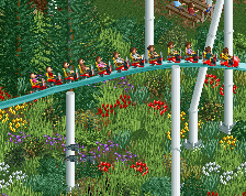
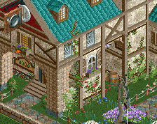
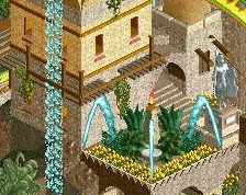
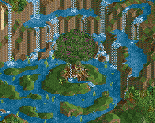
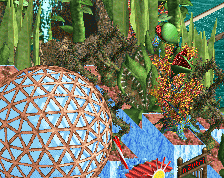
I came to think about my "style" of building RCT2 and I realised, that I maybe should stop trying to build realistic, as I can't really build realistic (although I basically live in theme parks). I just don't have the architectural eye, I guess. But what I do have is a shitload of crazy and insane ideas. So why not build something that's just completely ctazy, insane and over the top. But first a rather normal screen.
-
 Full-Size
-
 No fans of this screenshot
-
 Tags
Tags
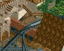
terrible cropping
There's just not a lot here. I think if you stop rushing new projects just for the sake of releasing as many things as possible you'll see some nice results. Take your time with this one.
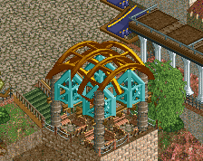
You have far too many textures going on here. That restaurant has 7 different textures and it just looks messy.
I don't "rush". What you call "rushing" is just building normal for me, as I have been somebody to rush a lot of things in my past. I don't rush projects, because for me it makes no difference if I have released 10 parks with a score of 30% or 1.
Yes, well done Version1. Be consequent with setting yourself free. Don't try to appeal to any style, build from within. You've been showing that for the past few screens and I see originality, which is great. It's a process though so don't let negative comments stop you. You have to develop your game now.