Screenshot / DisneySPACE v2
-
 25-March 14
-
 DisneySPACE
-

 4 of 5
- Views 3,313
- Fans 2
- Comments 9
-
 Description
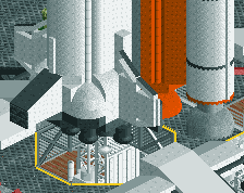
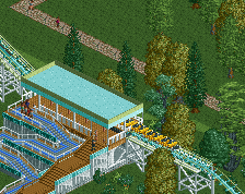
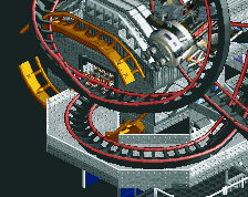
Here's the overview for DisneySPACE (v2.0). The park is split into 2 major halves: Exploration and Discover. Exploration (top right) would feature more realistic methods of space travel, along the lines of what actually goes on in our world today, while Discovery is more fantasy-based, taking much inspiration from Victorian-era visionaries such as Jules Verne and H.G. Wells, among others. The center area, CosmoCore, combined the two halves, and featured the park's most prominent icons: Space Shuttle Earth, the Saturn V, and Space Mountain, the park's signature E-ticket attraction.
-
 Full-Size
-
2 fans
 Fans of this screenshot
-
 Tags
Tags
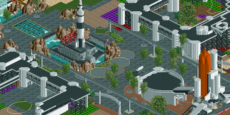

Fantastic. The all white buildings could perhaps do with a coloured stripe in places? Not sure though it might destroy it. Love the subtle recolouring of the trees too. Fantastic atmosphere, and this could be a great great park.
Looks really great! The only thing that maybe I would change are the semi-circular planters on both sides of the Saturn V because they look a bit empty or simple compared to the rest but this may be just because of unfinished-ness.Also i'm gonna be a geeky space bitch and say, the Saturn V is actually about 3 times higher then the spaceshuttle
I fucking love the waterfall and the glass path.
I love how this layout is sort of a nod to Epcot. This is great stuff, but I do think a little more color couldn't hurt.
Trust me, I know haha. Some creative liberties had to be made here.
nin, maybe you could make an invisible observation tower ride out of the saturn V, i know it's crazy but guests could go to the top of the rocket and then come down, don't know if it's compatible with the scenery around it though
Beautiful.
coolio
neatooo