Screenshot / Gustav CCD Dec. 1981
-
 03-October 21
-
 Gustav Goblin's Building Challenges
-

 2 of 30
- Views 2,350
- Fans 1
- Comments 12
-
 Description
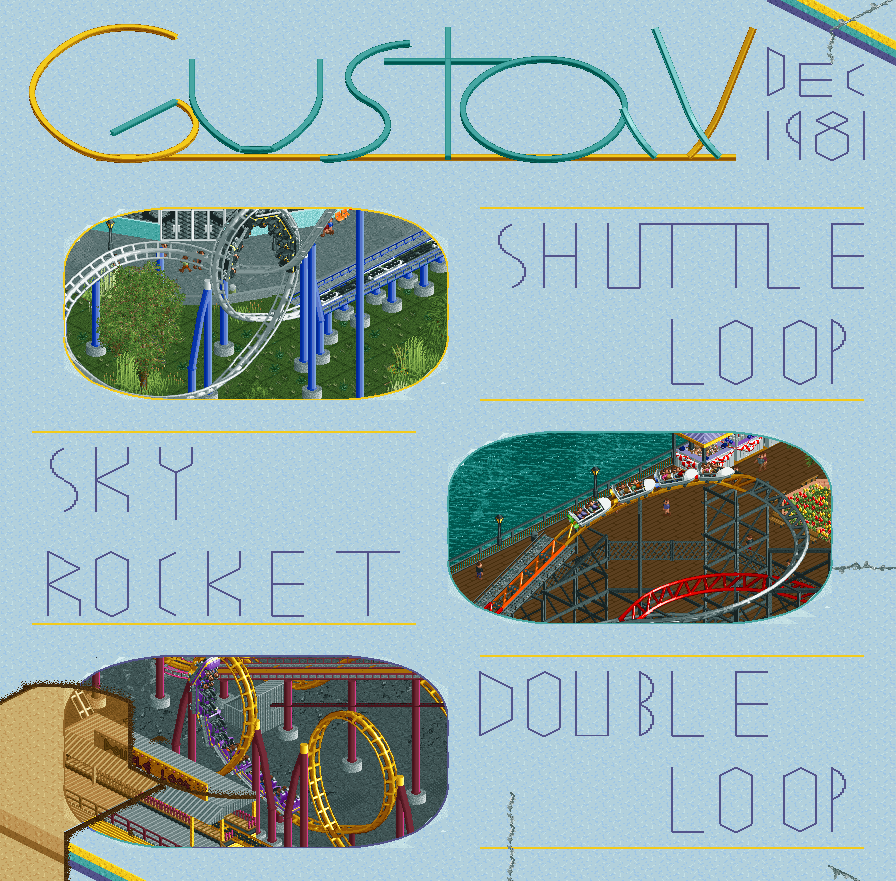
Found this scan from an old catalog on eBay just now. Dirt cheap, rough, but reliable as ever; just like a good ol' Gustav.
Ever since I got ORCT2 and joined the RCT subreddit, I've noticed I tend to gravitate towards smaller-scale Schwarzkopf-style designs. Every time I'd hop in a server, I'd make a shuttle loop or a family coaster instead of the towering hypercoasters you'd see all over. For at least four years now, I've nicknamed these designs Gustav and have wanted to flesh it out into a fictional brand. This was my golden opportunity, and In:Cities and WhosLeon's work from the last challenge inspired me to frame it as a page from a catalog.
Placed 2nd in the Brand New Brands building challenge in the NE Discord. Fun fact; the logo is supposed to be a shuttle loop! -
 Full-Size
-
1 fan
 Fans of this screenshot
-
 Tags
Tags
This is super cool. The little paper tears and coffee stains are nice details.
Would you like your coffee spilled all over your layout or on the side?
At first glance this seems just okay, but when you realise the entire thing inlcuding the text and background is RCT.... That's when it becomes impressive.
Bruh
Love it, nailing that 80's look! Great details too with the tears and the coffee stain. Also love a good meta idea in RCT, as well as fictional brands of any type, so this challenge was really fun, I thought, even if I didn't end up doing anything relating to RCT itself (seriously considered it though haha).
For future parks you should definitely use Gustav as the company name for Schwarzkopf-style layouts! Like "Looper (Gustav 1987)".
I've thought about it! I've been sleeping on turning an old project into a timeline park and I want to integrate Gustav into it. Watching a bunch of Defunctland made me realize that could be an awesome concept.
Shades of RobbyHood
Robby is nuts so that's a hell of a compliment. I still have no idea how anyone would think to do the Tetris bridge park.
Demo Offline
i realised reading your comment, that's how unexpected it was to me, i did read the description but it wasn't mentionned, why would you leave the less smart of us in the shade ?
Got a few bonuses to share but I want to thank you all for the reception first. I've spent years on this site fanboying over all the incredible parks and screenshots without contributing much of worth myself, so to see you appreciating my work just as much means a lot. I'm hoping I can turn the experience through these building challenges into a crazy Micro Madness run or a role in a H2H team.
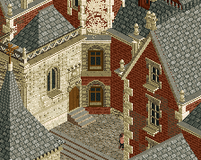
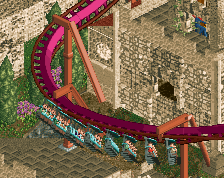
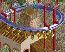
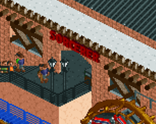
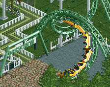
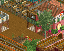
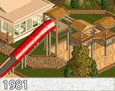
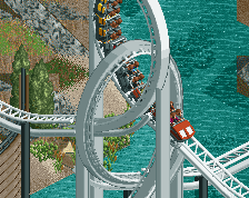
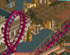
Yes, believe it or not, every single bit of this screenshot was done ingame! The only part done in a photo editor was compositing each coaster's best "pose" since I didn't have time to synchronize them all. Making sure everything was at the proper height, filling in the gaps between the diagonal walls and the "image" borders, the custom supports, and especially the text was frustrating as all get-out. I learned the hard way that making text in RCT2 is way harder and clunkier than you'd expect, and I had much higher expectations for it.
EDIT- It's only now that I notice I painted a piece of Sky Rocket track red to indicate it needed supports and forgot to paint it back. Whoops.
And just for kicks, here's a mock-up of what I intended the logo to look like. I decided to add a purple underline for kicks.
Take 2 with no purple underline and modified borders to better emphasize the shuttle loop shape.
love that lettering.