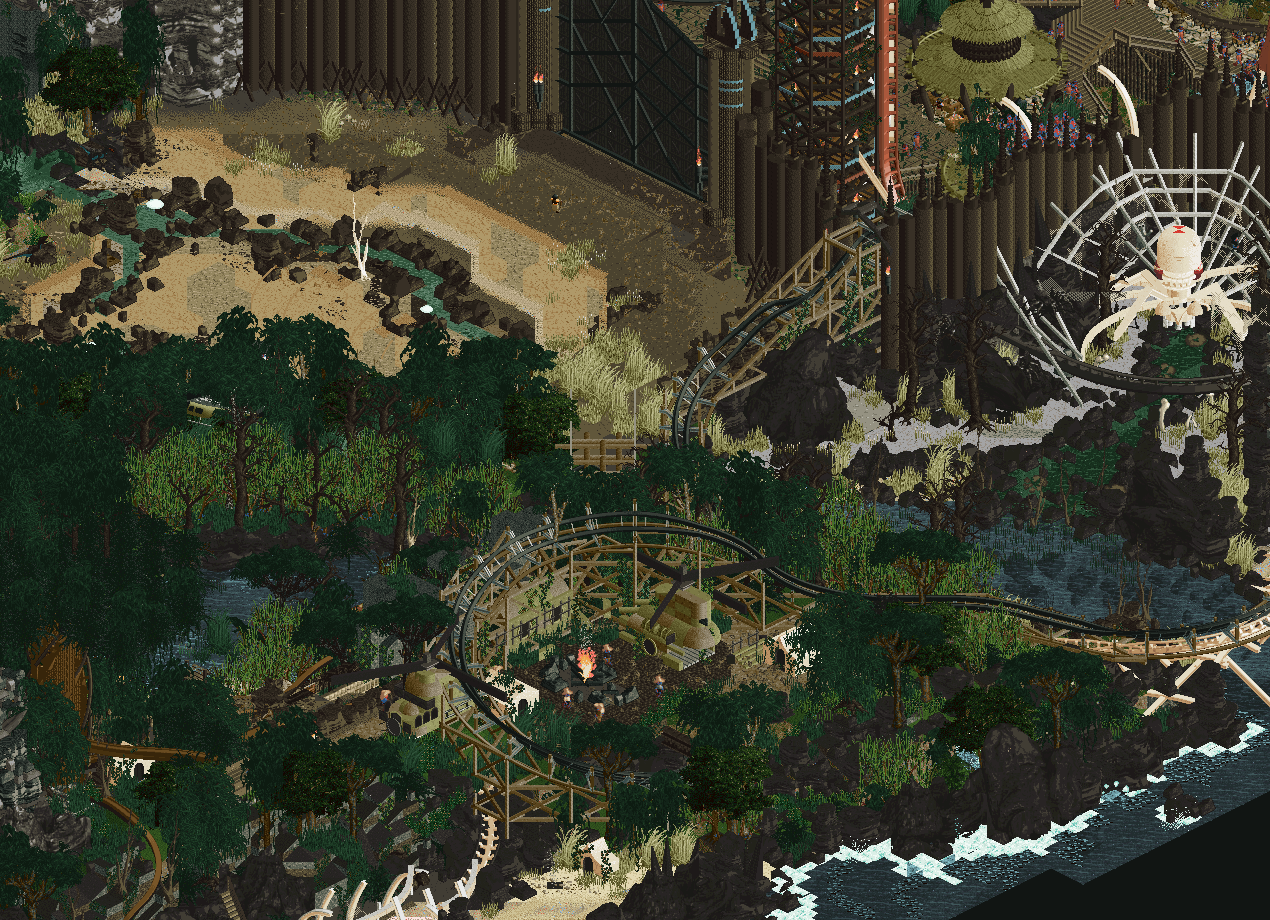
Screenshot / Lost World - Big Spider, Survivor Camp, Landscaping
-
 27-September 21
- Views 1,983
- Fans 3
- Comments 10
-
 Description
Featuring
- Hydro (Village walls/gates/etc, Skull Cave, some land texturing in front of the gate, Big Tree)
- Hex (Coaster layout and supports)
- Sens (Various foliage stuff I think)
I did the rest. Although it was truly a great team effort in the end. -
 Full-Size
-
3 fans
 Fans of this screenshot
-
 Tags
Tags
![screen_7215_Exodus Of Gomorrah[WIP]](https://www.nedesigns.com/uploads/screens/7215/7215_thumb.png)
whos responsible for this rating? lol
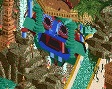
Amazing screen, love the aesthetic and the detail you sorta have hidden in here. Makes it more enjoyable to expore.
Eyyyy that feature though!
Sorry, but I don't find anything super appealing in this screen. Not a fan of the palette. There's no signs of movement (at least from what I can tell, but could be my eyesight.)
Incredible, but that palette...
Man i love that pallet, there is a ton that is super appealing in this screen! The heavy stillness of the rainforest or jungle is so tense, it really add a lot of contrast in a cool and unique way. The more the like marinates in my mind the more I love it.
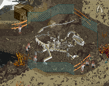
Good grief, I get Namibia texture vibes, jungle colors and a fantasy Shelob giant spider vibe.
...and as much as I love my pastels, why the palette grief? It is doing what it should for this scene.
Josh, don't stop being awesome.
SOMEONE GETS IT!!! Thank You!