Screenshot / Columbia
-
 12-September 21
-
 World's Delight
-

 3 of 3
- Views 1,659
- Fans 1
- Comments 9
-
 Description
In an effort to keep this projects energy alive, I wanted to share a new screen and some info.
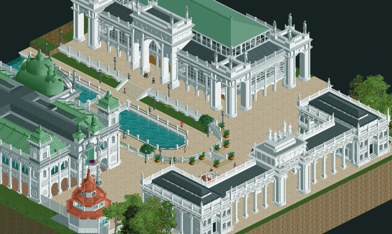
Columbia is the first land of the World's Delight theme park based on the 1893 World's Columbian Exposition. Will serve as the opening area with transportation, retail, exhibits and dining.
Seen in this image are just a few of what Columbia has to offer: "the Peristyle" - the parks entrance archway and guest services, "the Exhibition Palace" - (left) inspired by architecture on this website, serves as the parks main merchandise store, and "the Cultural Hall" (right)- based on the Manufacturers Building, serves as the parks main apparel store. -
 Full-Size
-
1 fan
 Fans of this screenshot
-
 Tags
Tags

Wow, good comeback screen. Reminds me a lot of Robbie's World's Fair, but with extra space (which is welcome).
I like everything that's here, but it's missing some life on the paths. Clean is good, empty is not. Can you do some nice (subtle, not highly constrasting) patterns in the path? Some large banners or flags or something can also provide some movement and colour here.
But yeah, great screen!
Thanks Liampie! I really appreciate the advice on the paths, I will surely add some details to the paths to give it some life, I just wasn't sure what to add besides lamps haha, with your suggestion now I have stuff to actually add!
Yes huge shout out to Robbie's world's fair park, the building style in that park felt really good to emulate for this section. I searched this entire site to find world's fair inspiration as well as googling images of the real world's columbian expo.
Gorgeous! I agree with what Liam said though, find a way to liven up those paths. Another suggestion could be to add some detailing with different textures. Nothing like some good ol' crunch.
Really lovely structures, always liked the world's fair/exposition aesthetic. Only complaint is the general lifelessness at the moment and I think liam's suggestions would help with that.
Buildings right now look to be floating on the path. You want to add some depth. A different kind of path underneath the buildings (like you did on the left) already looks a lot better.
Nerd alert: If you had used mathematics, while also repositioning the buildings, along with additionally raising the center tower of the entrance, then the exposure of the path on the right (after the entrance and in-between the right-side building), would have provided an even amount of path seen by the eye, in a more pleasing shape around the buildings, thus allowing the path to be more so as negative space, and breathing space as well, and without the need of many more path details, drawing the eye to the architecture as the focus, but without an overkill of detail. But I do agree with Lotte that still, there should be differing path under the buildings, and perhaps around the columns. However, this screen is still quite amazing. I’ve gazed several times at it and I really love it. It’s inspired my music (in it’s artistic quality; not in content).
The archy is outstanding, that's for sure. Really well done on that part, no remarks. My personal gripe is that it needs the breath of life. Some signs, small stalls, peeps... to make it less static and more alive.