Screenshot / Craftsman Village
-
 08-September 21
- Views 2,997
- Fans 2
- Comments 9
-
 Description
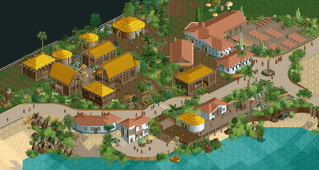
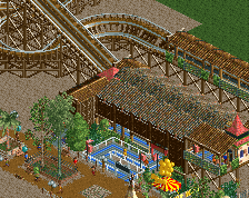
This area built on eroded land is now open to the public.
The first trees harvested were used to buid little houses using traditionnal low-energy techniques.
Who wouldn't want to enjoy the compost gathering toilets ? You can even share them with horses !
There is also a little restaurant, selling organic food grown in the park and fishes farmed in the pond.
Guests are now allowed to follow activity and even practice what they just learned like mixing clay or making terra-cota roof tile.to supply other area of the park. Also nursering cactii, to make them cheaply available for the further reclaimation of the eroded land.
The main attraction being the goat milking contest, in which every guest can participate :).
Looking for advices to make it look nicer/ more accurate to what it's supposed to represent. -
 Full-Size
-
2 fans
 Fans of this screenshot
-
 Tags
Tags
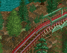
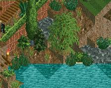
wow, hello, welcome. If you're looking for feedback I would say more path decorations: benches, trash cans, lamps, planters, lined stalls, etc. Things to make walkways more interesting and add more life/detail to your builds. I'd also recommend some underwater landscaping. Doesn't need to be overdone, but it does look a bit strange to have plants floating on water with nothing below.
This is an excellent first screen, I really like the variety of textures and building materials and the fluid path shapes you've developed. You seem pretty comfortable already with diagonals and curves, and have a good sense of texture and theme
nice storytelling!
This is an excellent debut screen, wow! There's not a lot to dislike, and a lot to love. I like the diagonal building, and I assume there are going to be more diagonals here and there. The more you do stuff like that, the more it will look like it belongs. I don't mean everything has to be diagonal, but just make it a recurring thing. The yellow roofs are a good example of this. I always say you can get away with a lot, as long as you're consistent. The roofs make more sense as tan or another shade of brown, but you chose yellow for some reason. You did it consistently, and it looks great!
The one thing I like least are some of your object choices. You've got two umbrella styles, but only one looks like it belongs... The rock objects you chose are without exception horrible, even though the LOTR rocks have some support in the community. I see you also used some land blocks in places... That's probably your best option here. Personally I'm a fan of the krypton rocks too.
Anyway, keep us in the loop! Also interested in seeing your past work perhaps. This can't be the first thing you've built!
Hello. You’re already great. But some things could perhaps see improvement. Maybe have your fencing contour the path more (not just on the flat curves and diagonal areas, but also on the upward and downward slopes). Maybe smooth out the transition with the rocks and the sand on the bottom left of the screen. I’m wondering if a rule around here could be added to with that rule being darker and taller trees more centered in clumps of vegetation while becoming lighter both in color and in the amount of vegetation which grows shorter as it spreads out. I’m not sure. More cacti? I only see one? Maybe work on the palette of the area then. I always liked the idea of limited palettes as perhaps that allows a more cohesive appearance. Or ignore me. Most do. Just have fun and work with a lot of thought in every object placement, as it seems you do. Have a direction and a vision as it seems you also do. Download tons of parks and study them. Pretty much everyone here does incredible things with this game. And keep it up with the story-telling. Adds depth. And no matter what, build for yourself. Don’t get sucked into treating it like a career. That’s always hilarious. Be yourself and make your work special. If you stick out as unique, you won’t get lost in a sea of fish. You’ll be a shark. Enjoy.
yo i love this. great colors and great storytelling. welcome!
Agree it's a sweet screen and impressive first. Perhaps you could try to make the path less liny. Think it might look nicer if it's part of the foliage, not carved out from it.
Demo Offline
Thank you for your feedbacks and support !
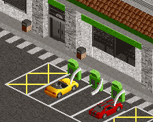
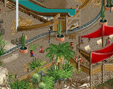
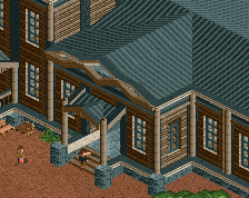
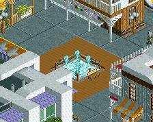
I have added details to make the place more lively, tried to make it more obvious why the weird diagonal building by adding rocks visible from both angle, provided a view from back too, changing some umbrellas cement fence, cactii in planters ...
This area is the most detailed part of a map i started with the intent of making a very-large (215x215) pretty open scenario map. Ideally wishing to make some path layout, transport rides, shops and stall but only 1 or 2 rides at start, objective being make X coaster with X ratings following or not the story that goes along. I have made several of these maps already, increasingly big with only few areas detailed while the landscape is just a shape but this is the one i used the more CSO and spent the most time on.
For this reason i didn't want to change palette nor did i used .parkobj , because (sadly) not exported with the save. For rocks i tried to pick recolorable that works for dark brown and grey for versatility, included kryptons, landblocks and more, trying to use a conjunction of them in different places, but thinking the more i placed them the less freedom for the players. Same deal with the paths, those i placed, to make sure not too many guest would get lost, but my layout/choice is most likely not the best .
.
I have around 10% item left in each category for the bench.
Nice improvements :-)
It may just be me, but foliage seems a tad messy. I would differentiate between natural areas of foliage and areas where it is planted by people. Perhaps the natural areas having clumps of foliage that are dense with full trees, but then spreading out, lessening in amount, and becoming more of just plants or grass as it spreads out. And with planters then more organized and intentional in placements of trees and plants. I would also reduce the variety of different types of foliage. Just my 2 cents. :-)