Screenshot / Fire Strom
-
 15-July 21
-
 Volcania
-

 5 of 9
- Views 2,188
- Fans 0
- Comments 5
-
 Description
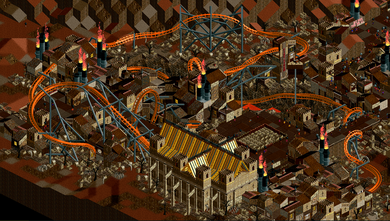
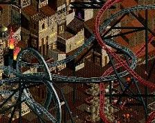
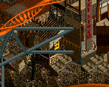
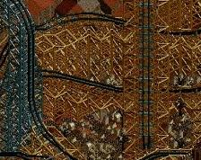
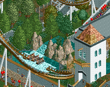
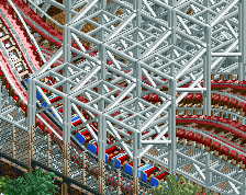
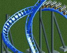
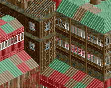
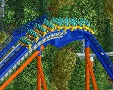
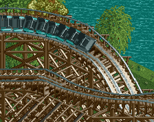
This is the first major coaster for the park. The park is for the DKMP timeline park contest so I collaborated on the story with swagtitties so parts of the coaster is from his park. A big focus with this coaster was the interaction with the path and I think I succeeded. This is also my first attempt at doing supports through an entire layout and im pretty happy with how they came out. The idea with the stations is to have them as buildings that survived the apocalypse as they stand out from the rest of the park making it more obvious where the coasters are.
-
 Full-Size
-
 No fans of this screenshot
-
 Tags
Tags
Coaster looks good
Double corkscrew under the path is refreshing. I always see it over the top.
I get that the sky seems a bit darker, but overall I wonder whether some other palette choice would help convey a stronger, more sinister mood. This palette kind of displeasures my eyes, but maybe that's just me.
~B-]
Luketh