Screenshot / Montage
-
 07-July 21
-
 Mezzatore
-
 1 of 3
- Views 2,387
- Fans 1
- Comments 11
-
 Description
Long time fan of RCT and NE and finally posting for the first time!
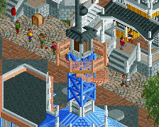
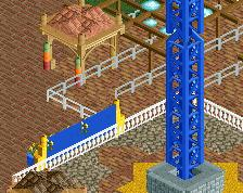
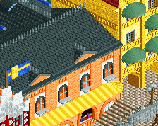
This is a project I have been working on recently, loosely based on Hotel Mezzatore in Ischia, Italy. Still a WIP with more to come but I wanted to share it with the NE community. -
 Full-Size
-
1 fan
 Fans of this screenshot
-
 Tags
Tags
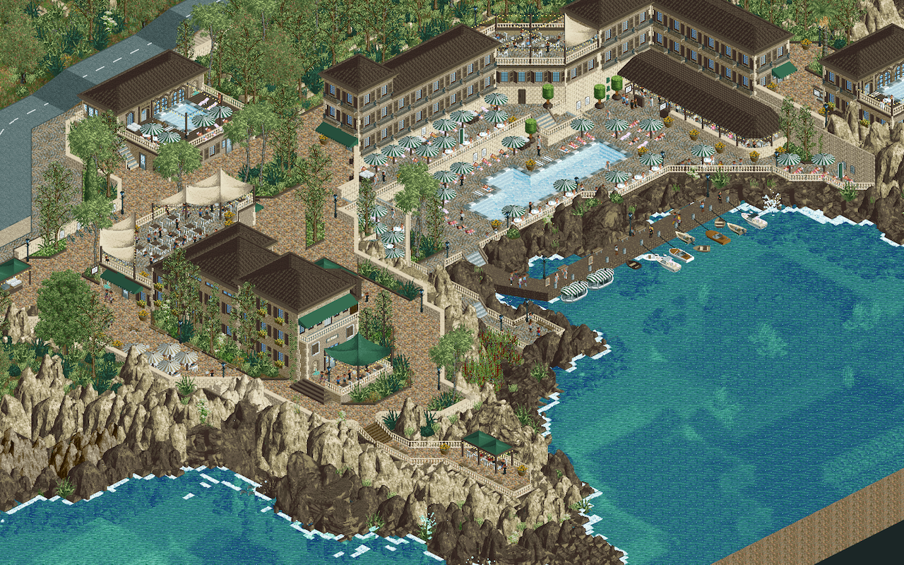
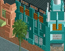
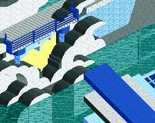
its a good start but its really missing that pop of red that makes that hotel work- right now the two-tone rocks blend a lot with the building colors and it gets a bit muddy. I'd recommend cleaning up the rocks (one consistent tone, more detailed texturing, more interwoven foliage) and using more bright colored tones to make the archy pop
I'll let Cocoa and others hand out areas to work on, but for a first screen this is very good. The changes needed are minor as your overall building skills are great. The European feel is there, in particular your terraces are very nice, good work!
Welcome! Man this is great. Cocoa offers some good critiques. I'd argue that the duotone rocks aren't necessarily bad - as the issue for me lies with the overuse of those large LOTR rocks. Maybe try to intersperse some natural landtiles to help sell the verticality - or even some of the custom colorable landblock pieces. (i made a set that can be found in the Lost World park).
As for colors - I definitely agree that the red needs to be there so that it can pop. Making the hotel itself a tan or brown color is too "safe" and doesn't pay off unfortunately. Go with the red!
Great work though. Really hope to see more from you!
scenery lovely, very good
Id like to see a few different colors in the archy, its a bit funky now with just the browns and tans. Very good tho!
Can definitely tell you were inspired by some Grand Tour stuff, but who didn't find those maps inspiring? This is quite impressive, I love the cohesive look - a rare thing from newcomers. A splash of colour here and there would be good indeed, but not too much! The base of browns with the dark green awnings is lovely. How does it look when you make all the tile roofs reddish brown?
oh i didnt see this was your first screen, welcome to NE lol (probably telling that its quite good that I didn't realize it was your first...)
Looks very nice. I like the colours you went for.