Screenshot / Fire Storm WIP #1
-
 22-June 21
-
 Volcania
-

 4 of 9
- Views 2,116
- Fans 0
- Comments 5
-
 Description
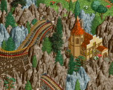
An inverted coaster for my post apocalyptic theme park made out of multiple track types to give it that thrown together vibe. Part of the ride is over a ravine filled with lava so all the supports have to connect either side of the ravine which was a fun challenge.
-
 Full-Size
-
 No fans of this screenshot
-
 Tags
Tags
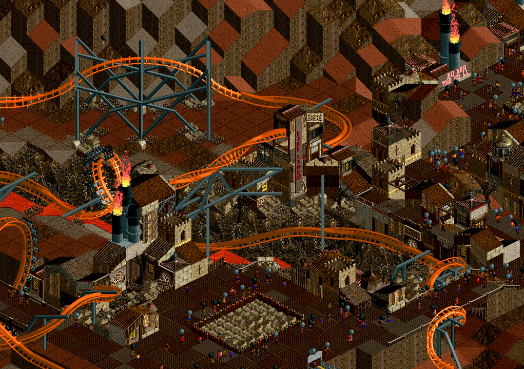
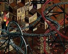
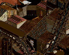
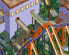
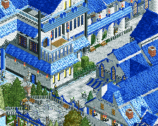
Everything feels too grid-like. Almost all your structures seem to be 1x1 buildings smashed together and don't really seem to serve a purpose (or their purpose is very undefined and unreadable.) Also, this is just too organized IMO for an apocalypse/post-apocalyptic theme. Where's all the chaos? I do like the path/coaster interaction, and the colors. Supports are okay too.
Also make sure to turn off gridlines before posting a screen. Doing that would definitely help this feel more organic.
"apocalyptic theme park made out of multiple track types to give it that thrown together vibe."
If you're going that route it may be beneficial to have a smaller layout as well as different track colors for the layout to give it the impression that it uses different "IRL" type coasters.
It looks nice visually though.
namitgpta Offline
How to download this??