Screenshot / Grey Castle Themed Building
-
 01-June 21
- Views 2,256
- Fans 0
- Comments 7
-
 Description
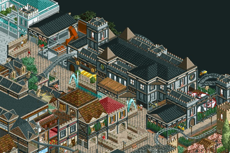
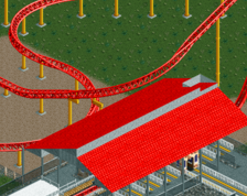
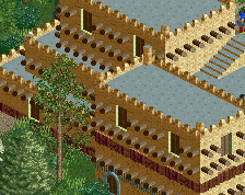
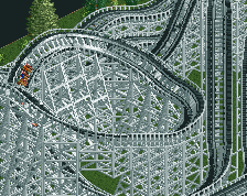
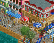
Just something I worked on a few months ago after redoing the whole area. Previously, it was just a hill with trees and stalls but wanted to continue the castle theme (the place to the right) You can also see a partial part of the white castle themed placed which I worked on after this one. Over time, I'll go back to this and clean certain parts, redo some buildings in the center (not drastically but make them blend in more with it's surroundings), and or make it less cluttered (though that's just how I build so I can't help it) but for now this will do.
-
 Full-Size
-
 No fans of this screenshot
-
 Tags
Tags
I really don't have a word to describe the vibe this gives me. It seems slightly nostalgic, and I have no idea why. I like it!
Pretty cool! But very heavy on textures. It could use some cleaning up to help make the important things stand out more and emphasize them. I suggest for starters a different, less textured path.
Has good potential but I would say is a little too dense and "elementalistic". That's to say there's a the blue building, then there's the grey building, then there's the red rooved one, etc. You have a play-as-you-go approach which in some later stages of showcase parkmaking is actually important, but in earlier stages can sometimes result in lack of stylistic language and bigger picture, ie wholesomeness. Perhaps it can help to lay out rough goals for your map, what you want on it, how they connect conceptually, and then execute them, whilst allowing yourself enough freedom still.
Appreciate the feedback. This park has no end goal and it's real purpose is to just build different style, realistic or not. The buildings in front will be redone since they are outdated and have been needing to change them for awhile since the surroundings have more "actual theme". Eventually I will go back to everything and start to polish/ blend areas correctly but that won't happen until a few years or so (since the map is big). Also, my style of building is simply just using textures a lot (it's just a habit) but I'll also go back later on to lessen it to. Lastly, pathing is just there to be there but will probably change later on too but I understand having the less texture path here isn't the best here so thanks for pointing that out.
This is pretty great! Yeah, its a bit texture-heavy, but I can appreciate what you're going for. I'd try to open up some plazas and leave room for green space (planters, gardens, patches of trees, open grass), as that'll help balance things out a bit.
Welcome!
I think the textures thing is less on the RCT textures you're using, and more on the textures you're creating.
As my eyes go over your main building, they're made to work very hard. The color changes from black to grey to black to grey to black to grey etc.
If you had a grey window frame over the gray castle walls for instance, you still have the same amount of texture. It just doesn't hurt quite so much to look at !
In places your paths could be a little more open. Specifically, at the start of the queue coming out of the 2x2 with the red roof.
Don't be discouraged though. And please don't feel like you have to go back over every damned thing until you can post screenshots here and be met with unfettered praise! If you're enjoying building, just carry on building out. You'll finish the park, and have fun building the next one a little different! If you take any advice from me, take that - I feel a little qualified to give it as someone who must have spent thousands of hours on RCT2 and never finished a park!!
Definitely shows a lot of promise, creating more open space for planters and the like would help as josh says as would managing your texture use. It's got a nice atmosphere though, very charming.