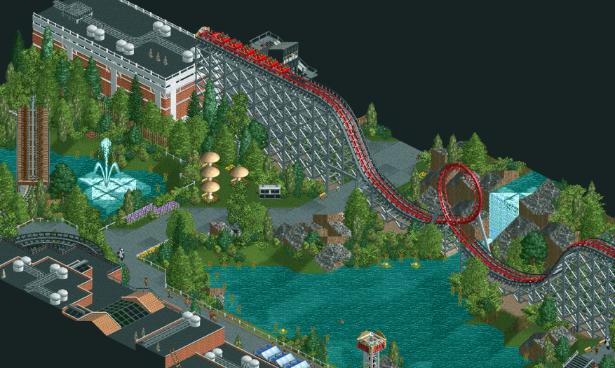
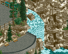
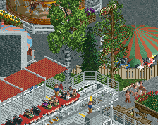
This has a really nice, serene atmosphere. The brick building with the white trim in the top left, the textural variation on the path, and the foliage density are things I like in particular.
Sublime! Some people above have been saying that this screen needs a little more pop or pizzazz, but I disagree; I think you've hit a really good balance here of blocky/boxy structures, and sinuous land relief with its wandering footpaths
I also really like the colours. It's obvious you were going for a more realistic look, and I think the palette used here matches that well. Most IRL amusement parks aren't garishly over-saturated; They tend to be more muted and understated with splashes of bright colours here and there, which you've certainly emulated well here.
 22-April 21
![screen_3206_[Mostly] NCS Station](https://www.nedesigns.com/uploads/screens/3206/3206_thumb.png)
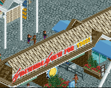
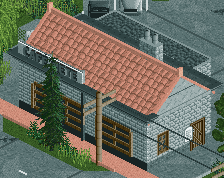
This looks great! Very curious to see the other side of the building. The diagonal half-water tile is an interesting trick I haven't seen before.
Quite nice. Liking the foliage. The grey is a bit heavy overall.
Finally, someone else discovers the NCSO diagonal half water trick!
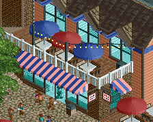
Great landcaping. I just can't with these toadstool parasols tho, they really need to stop being a thing.
What are better options? Minigolf hole A?
no i dont like that either lol. It's just me though, I think most people here don't mind.
i usually just go without, or place seating where I can use a single, larger awning which covers a few tables
I don't think it's necessary to have catwalks for nearly the entire layout; just doesn't look great to me.
The rest is very clean. I don't think I'll ever be on board with the NCSO version of path crunch via steel blocks, but that's just me.
Looks nice, maybe a bit too nice? Needs some more spice i think.
Sublime! Some people above have been saying that this screen needs a little more pop or pizzazz, but I disagree; I think you've hit a really good balance here of blocky/boxy structures, and sinuous land relief with its wandering footpaths
I also really like the colours. It's obvious you were going for a more realistic look, and I think the palette used here matches that well. Most IRL amusement parks aren't garishly over-saturated; They tend to be more muted and understated with splashes of bright colours here and there, which you've certainly emulated well here.
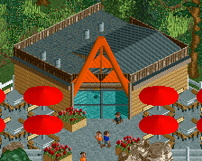
Lovely screen, kudos